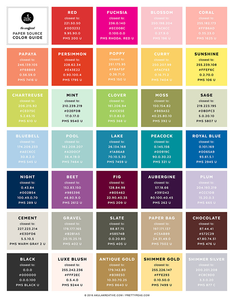
the unofficial Paper Source color guide
ORIGINALLY POSTED ON 07.16.12. / LATEST UPDATE: 01.29.16
The Unofficial Paper Source Color Guide
After scouring the web for the closest Pantone match to Paper Source'saubergine, I gave up and decided to figure it out on my own. I read various blog posts about this (namely on Wedding Bee boards), and people mentioned having the same problem.
There really AREN'T any perfect Pantone matches to Paper Source's lovely array of colors. Color matching is, and always will be, a complicated and subjective process. That said, I did my best to come up with a color guide that can serve as a starting point for your exploration. (I say "starting point" because that's exactly what it should be. Start with a combination I suggest, then adjust according to your printer, paper, and monitor.)
In the printable 8.5" x 11" guide, I have provided the Paper Source color name along with its coordinating RGB, Hex/HTML, CMYK, and Pantone numbers.
My Color Matching Method and a Bunch of Disclaimers
To create the guide, I opened all the windows and let in as much natural light as possible. I then used the most up-to-date Paper Source Color & Shape Guide to match up to my Pantone Color Bridge Uncoated, Pantone Metallics Coated, and Pantone Pastels Uncoated swatch books. Some colors really didn't have a "match" at all, so I matched them with the closest thing I could find. Keep in mind that the less color you use, the closer it will appear to your Paper Source paper. In other words, if you print some skinny colored text on a white card stock invitation and stuff it into a coordinating envelope, people would hardly notice they weren't the same exact color. BUT if you decide to color block your entire invite with Clover, chances are it's going to look different when it's next to your Clover envelope.
Disclaimers:
- This guide offers suggestions for colors that are CLOSE to Paper Source's (and Waste Not Paper's) 2014 line-up. These are NOT exact matches by any means.
- I created this guide with my eyes, my studio light, and my computer monitor. Obviously, all of these factors will change when you use it. So, I suggest starting with a combination I provide, then adjusting little by little with your printer and/or monitor until you're satisfied. *If your printer is requesting an exact Pantone for the ink, I recommend mailing them the paper you want to match. You can say, "It's close to Pantone XXX, but please match it to the paper I provide." A GOOD printer will allow you to see a sample of the color on your invitation and ask for approval before printing everything.
- This guide is completely unofficial. I'm providing it because I think it will be helpful to a lot of people. I am affiliated with Paper Source in no way whatsoever (other than being a big fan).
The PDFs below are free for personal use only. If you share, please credit the correct source.
UPDATE :: Thanks to Kelly's comment below, I was able to get a hold of Paper Source's conversion chart for Pantones and CMYK. Two years later, in 2016, I've finally found some time to combine my 2014 guide with the official guide.
DOWNLOAD THE UPDATED UNOFFICIAL PAPER SOURCE COLOR GUIDE HERE (2016)
Thanks and happy color matching!


