a painted-protea-inspired color palette
AUBERGINE #482949 / FADED PLUM #77486A / DRIED ROSE #D4ABB1
PEACH FUZZ #F1CCC3 / A PERFECT CLOUDY DAY #DED9DD
WHAT ARE THESE COLOR CODES? The “hex codes” above are provided as a courtesy for those customizing website colors or looking for general color inspiration. They are not based on paint or Pantone chips. Remember that ink on paper will never look the same as light on a screen. If you like a combination you see, we recommend saving the image and heading to your local hardware store to find paint chips that match. Digital colors will change depending on your phone/tablet/computer screen, so be sure to color match with real swatches. Also, I make up all the color names.
Welcome to the third week of my color palette series featuring ARTISTS + MAKERS!
Don’t shoot me for sharing more aubergine, but I have to show you The Mint Gardener’s lovely proteas. Why? Well, 1) I’m obsessed with proteas, and 2) I’m mesmerized by Sarah’s Instagram feed. (Ok, so are 116k other people, but hopefully she is new to some of you!)
In her website bio, it says, “Sarah calls the Pacific Northwest home, and yes, she does enjoy the gloomy and rainy gray days a bit more than the hot, sunny ones.” When trying to think of adjectives to describe her watercolor work, the only one I could come up with is SOULFUL. See, she doesn’t just paint flowers; she creates florals, greenery, and landscapes that have real character and depth. The variety of her leafy stems alone is mind-blowing to me. (I have a hard time trying to come up with leaf shapes that are more interesting than just pointy ovals, and this is exactly where Sarah excels.) Every time I watch one of her process videos, I’m like, “Ah! That shape is genius!”
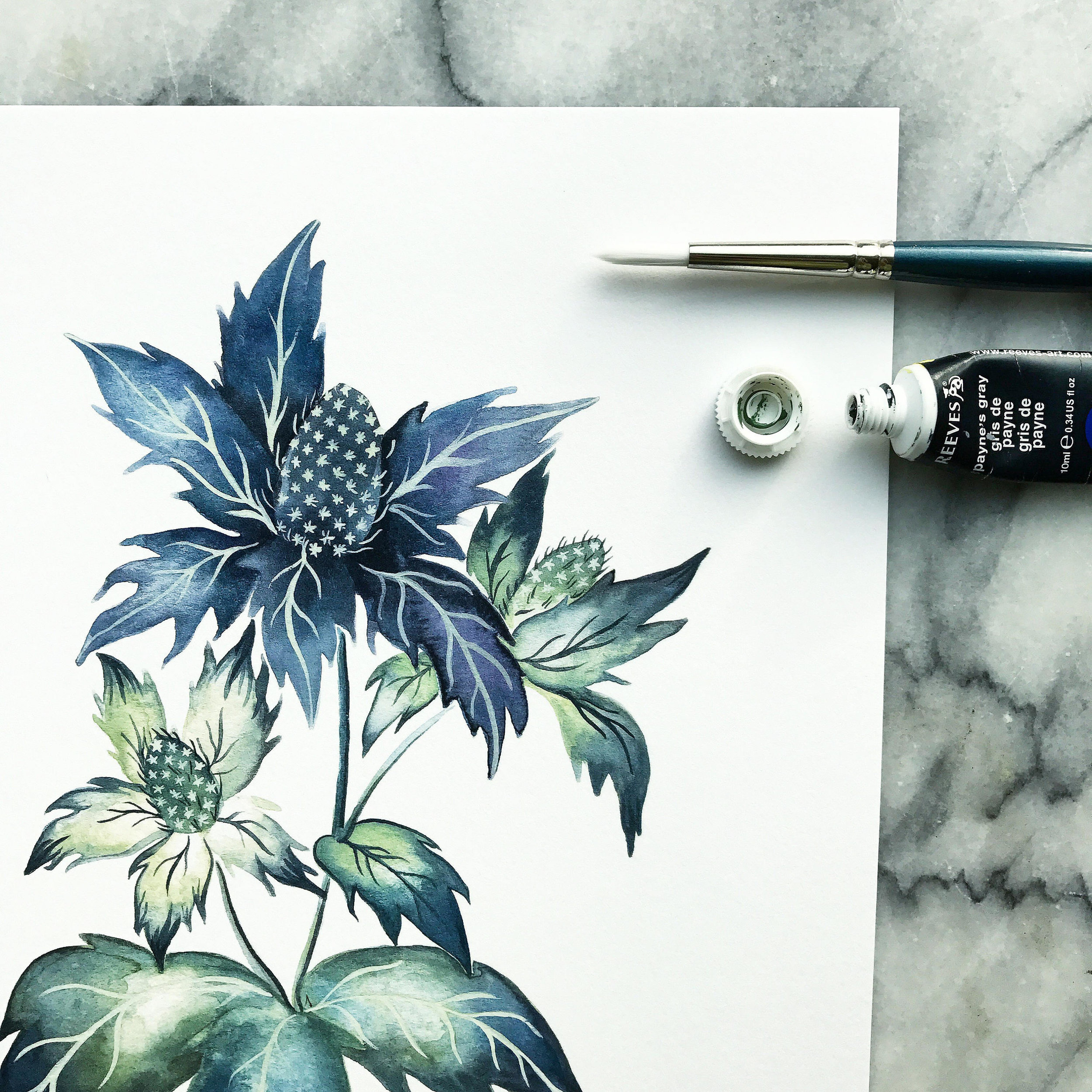
SEA STAR THISTLE WATERCOLOR BY THE MINT GARDENER
Now that you know Sarah likes gloomy, rainy days more than sunny ones, doesn’t her watercolor above make so much sense?! It’s beautiful, but in a moody sort of way. And, more than that, I love that this humble little sea star thistle is having its day in the spotlight. :)
Sarah, I hope you’re ok with me making a pattern out of your proteas, and thank you so much for sharing your immense talent with us!
Happy Friday!


