a pastel-paint-inspired color palette
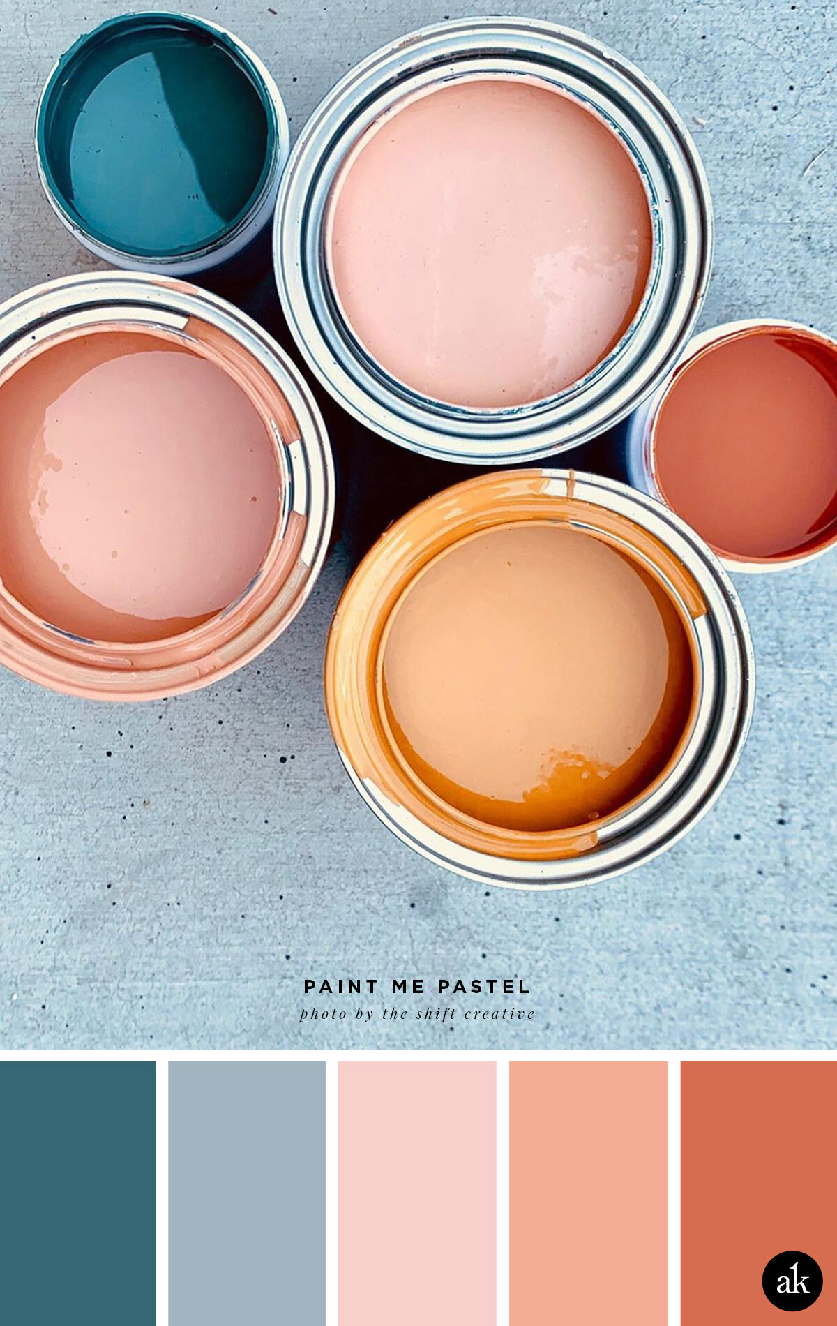
I will always be a fan of blush pink paired with indigo blue, but Shift Creative’s addition of tangerine gives it a warmer, more earthy vibe that I am really digging. It’s the perfect combination of cool and warm in a gender neutral palette! Quite possibly one of my new favorites.
INDIGO #366775 / GRAY-BLUE #A2B4C0
BRIGHT BLUSH #F7D0CB / WARM PEACH #F4AC94 / TANGERINE PEEL #D66D50
WHAT ARE THESE COLOR CODES? The “hex codes” above are provided as a courtesy for those customizing website colors or looking for general color inspiration. They are not based on paint or Pantone chips. Remember that ink on paper will never look the same as light on a screen. If you like a combination you see, we recommend saving the image and heading to your local hardware store to find paint chips that match. Digital colors will change depending on your phone/tablet/computer screen, so be sure to color match with real swatches. Also, I make up all the color names.
Happy Friday!