a butterfly-inspired-color-palette
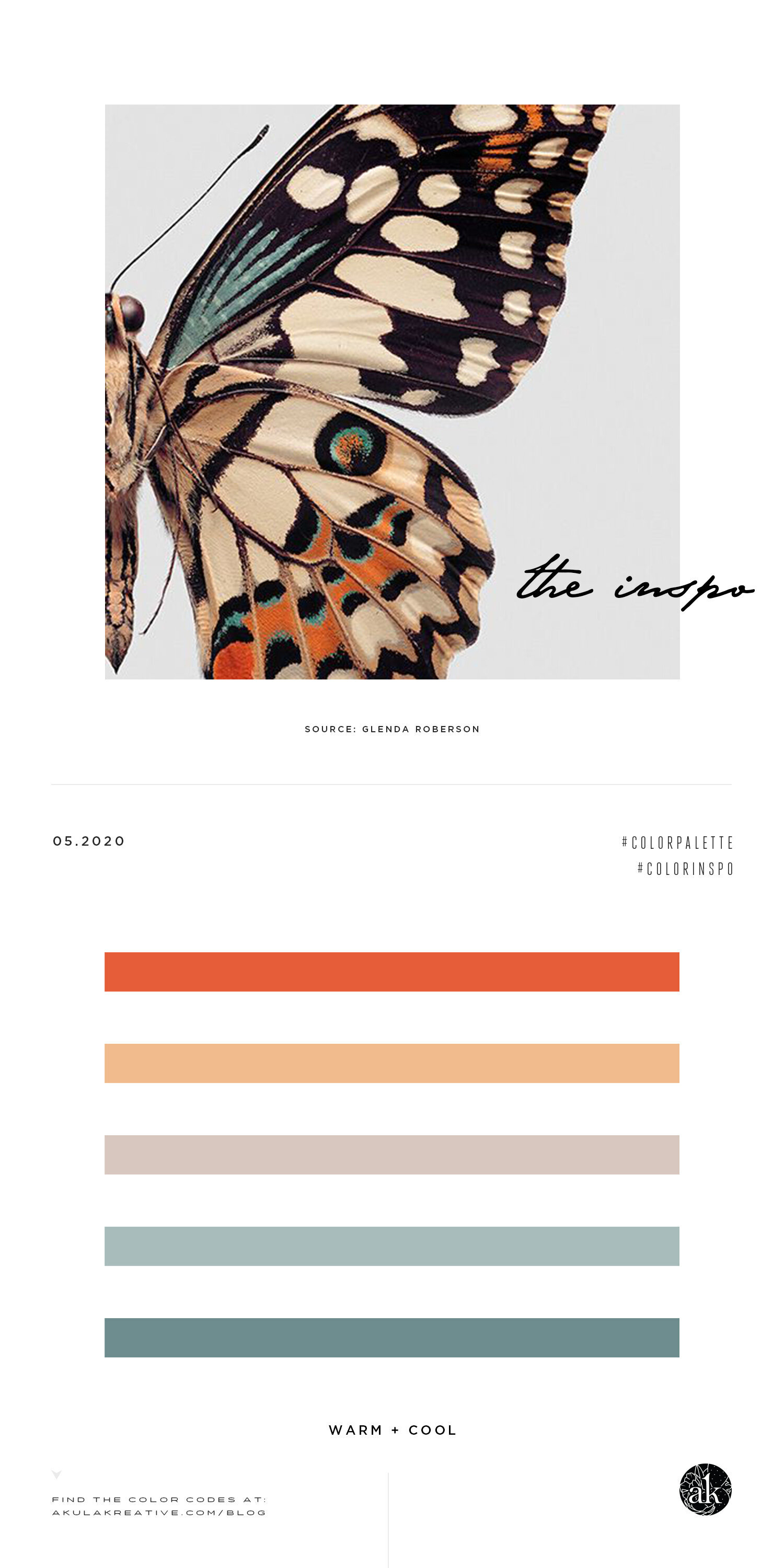
These are NOT colors I would have ever tried to use in the same palette had I not seen this [slightly modified] art by Glenda Roberson. (I say “slightly modified” because her original piece is not as warm as this image. Someone, somewhere, applied a filter to make it more “boho” as you see here.)
I mean…deep orange with a faded, tangerine-ish tone, beige-gray, and soft blue? Sounds…weird. But, I love it! Who knew you could mix gray with cream and orange with blue and somehow feel soothed by the combination of warm and cool???
Psst! If you love this butterfly image, you can actually buy a print of it here! (This is not a sponsored post, but I do believe you should know where I found this.)
OVERRIPE ORANGE #E65D39 / TANGERINE TINT #F1BB8D
GREIGE #D8C7BF / SOFT BLUE TINT #A8BCBB / SOFT BLUE #6E8D8F
WHAT ARE THESE COLOR CODES? The “hex codes” above are provided as a courtesy for those customizing website colors or looking for general color inspiration. They are not based on paint or Pantone chips. Remember that ink on paper will never look the same as light on a screen. If you like a combination you see, we recommend saving the image and heading to your local hardware store to find paint chips that match. Digital colors will change depending on your phone/tablet/computer screen, so be sure to color match with real swatches. Also, I make up all the color names.
Happy Friday!


