a handmade-paper-inspired color palette
I’ve been staring at this photo of pastel papers for weeks now, and I finally decided it was time to make a color palette with it! Let me tell you, though, it took some serious effort (read: about 10 minutes) to find the actual source. The image I originally pinned sourced a Tumblr feed…that sourced another pin…that led to nothing. Then I Googled “handmade pastel paper.” Nope. No luck. Then I went back to Pinterest, searched for the image, came to another blog, found it in an IG feed, and THEN found the maker who was tagged in a post. Oy! I was afraid I was going to have to break my own rules about giving proper credit by writing “source unknown.” Luckily, @foilandink tagged @farmettepress in her post, and voilà! Phew. Blogging is hard.
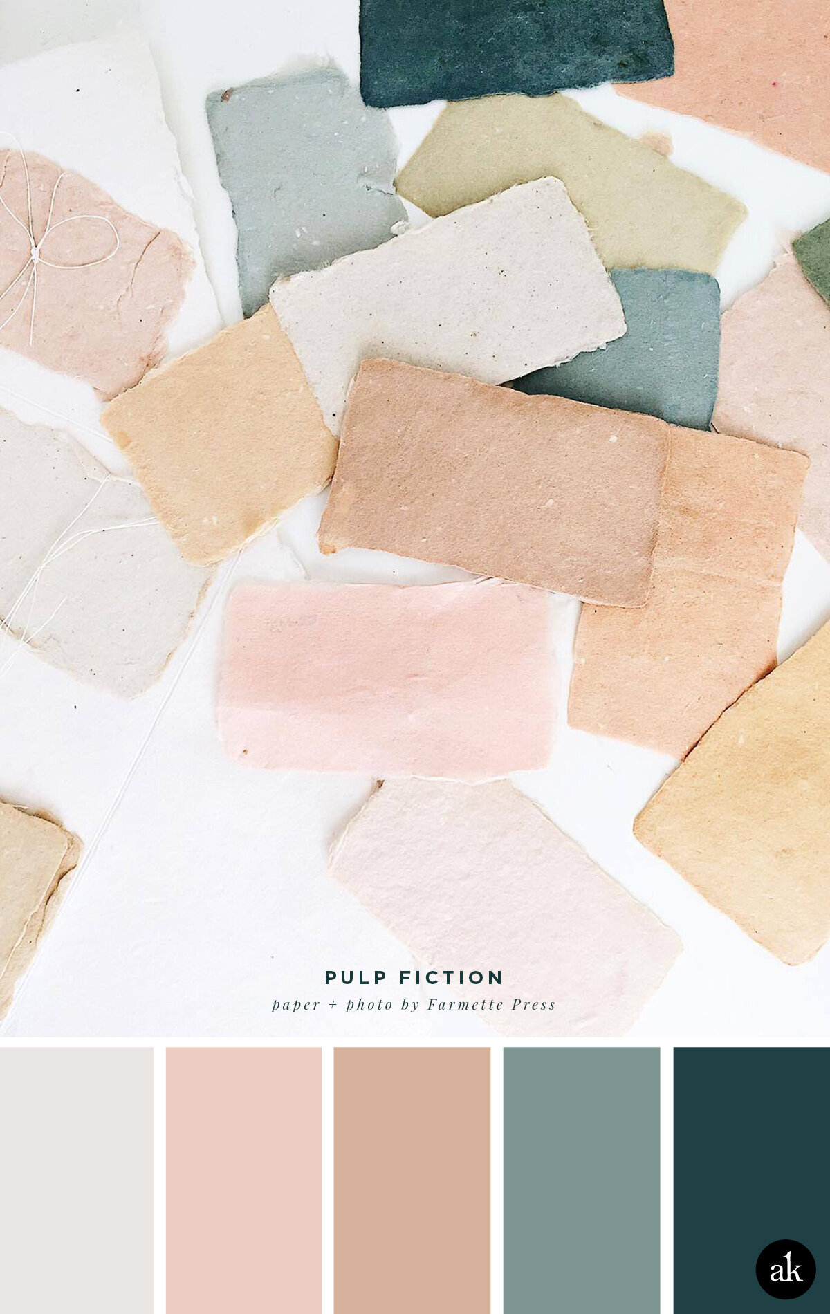
SOFT STONE GRAY #EAE6E3 / WARM BLUSH PINK #ECCDC4
MORE TAN THAN PINK #D5B19B / GRAY-BLUE #7F9593 / LAKE #1F4045
WHAT ARE THESE COLOR CODES? The “hex codes” above are provided as a courtesy for those customizing website colors or looking for general color inspiration. They are not based on paint or Pantone chips. Remember that ink on paper will never look the same as light on a screen. If you like a combination you see, we recommend saving the image and heading to your local hardware store to find paint chips that match. Digital colors will change depending on your phone/tablet/computer screen, so be sure to color match with real swatches. Also, I make up all the color names.
Happy Friday!