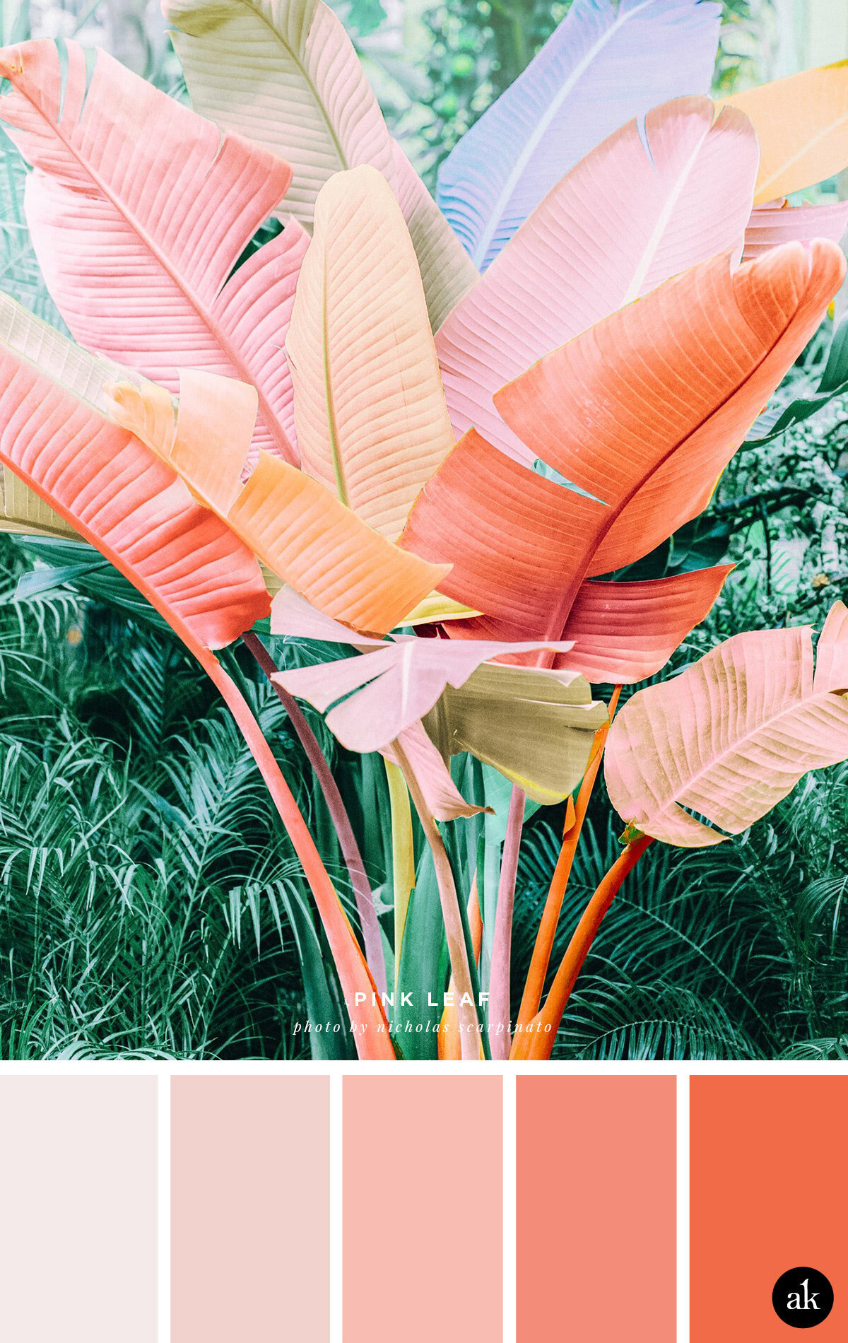
a pink-palm-inspired color palette
The more colorful a photo is, the harder it is for me to create a color palette. I saved (then re-saved) this one 3 times before actually publishing it this morning. My first attempt included a wide range of colors, from bright orange to pink to green to light lavender-blue. It was overwhelming! Sooo, I simplified things and went with a pink-coral-orange-ombré instead. This way, the palette remains bright and complementary but doesn’t compete with the photo up top.
If you love this palm, you can purchase a print of it here on photographer Nicholas Scarpinato’s website!
WHITE WITH A PINK TINT #F4EAE9 / SOFT CORAL #F1D2CD
LIGHT CORAL #F7BCB1 / BRIGHT CORAL #F38D79 / ORANGE #F06B47
WHAT ARE THESE COLOR CODES? The “hex codes” above are provided as a courtesy for those customizing website colors or looking for general color inspiration. They are not based on paint or Pantone chips. Remember that ink on paper will never look the same as light on a screen. If you like a combination you see, we recommend saving the image and heading to your local hardware store to find paint chips that match. Digital colors will change depending on your phone/tablet/computer screen, so be sure to color match with real swatches. Also, I make up all the color names.
Happy Friday!


