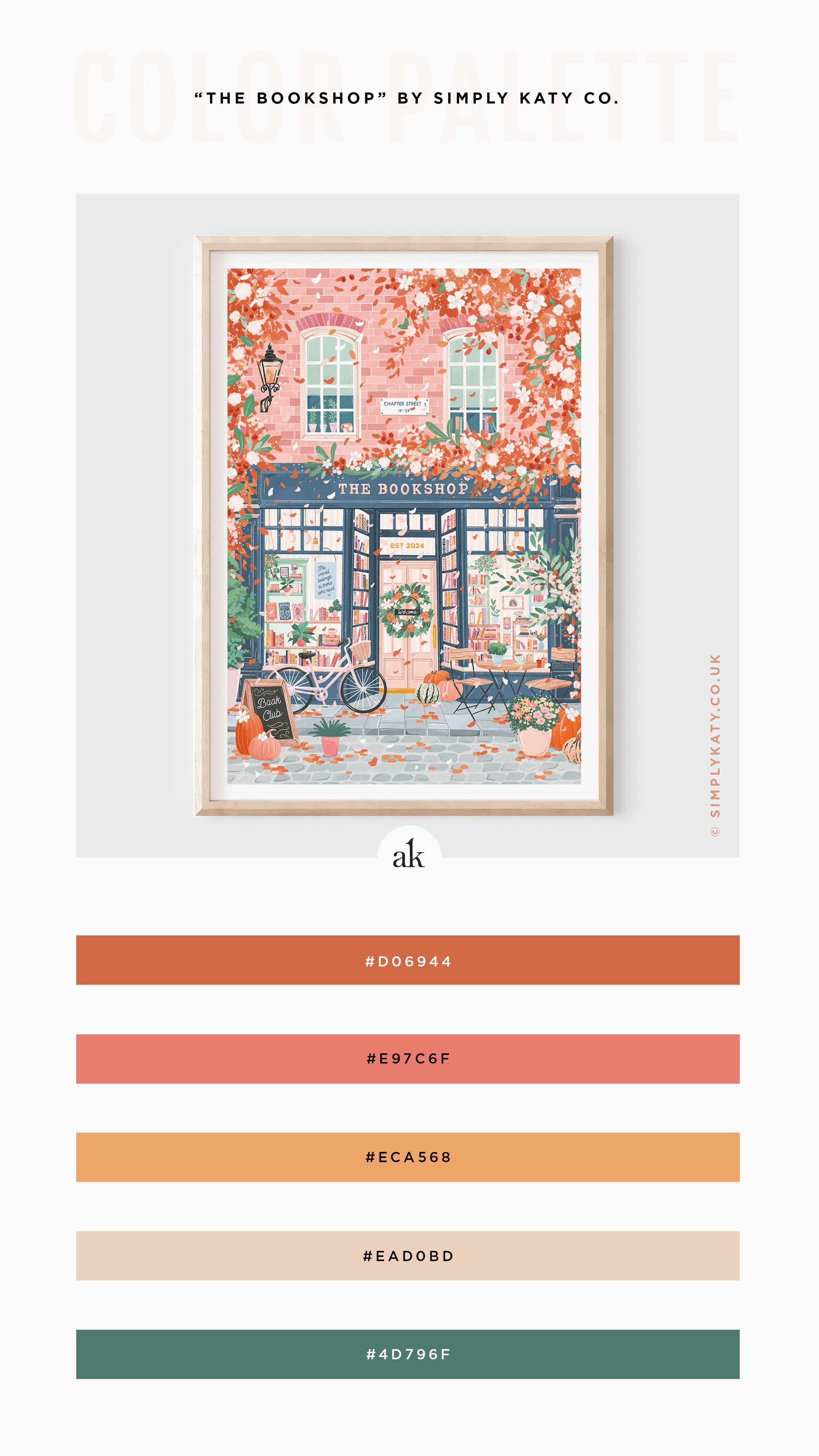
a fall-bookshop-inspired color palette
Today I’m sharing a fall color palette inspired by the work of one of my favorite illustrators :: Simply, Katy. Katy (based in the UK) specializes in colorful, digital illustrations of cozy shop fronts and picturesque city scenes.
For those old enough to have grown up watching the original Mary Poppins, do you remember Bert’s chalk drawings—in particular, the one of the carousel that everyone jumped into? That was, hands down, my favorite part of the movie. The penguins at the café, the carousel horses that joined in the hunt…so good! That’s what Katy’s drawings remind me of :: dreamy, picture perfect settings you wish you could live in, even if for only one afternoon.
Want to see something interesting?
The color that first drew me to “The Bookshop” (above) was that lovely blue-gray. (I’m a sucker for all blues that have gray tones.) However, my goal was to focus on that cozy FALL feeling. Including that blue accent made it feel too summery, so I went with green. You see, blue makes us think of water, while green reminds us of trees/foliage. See how swapping ONE color takes this palette from summer to fall?
Summer Option
Fall Option
Here are a few more of Katy’s fall-inspired art prints you might enjoy:
Happy Friday!
You can now download a free printable PDF of this color palette that includes values for print (CMYK) and web (HEX, RGB, HSL) - as well as the closest Pantone matches for coated and uncoated stock! It’s everything you need to recreate this color combo on your own.
Looking for more inspiration?
▼ ▼ ▼


