a pencil-inspired color palette
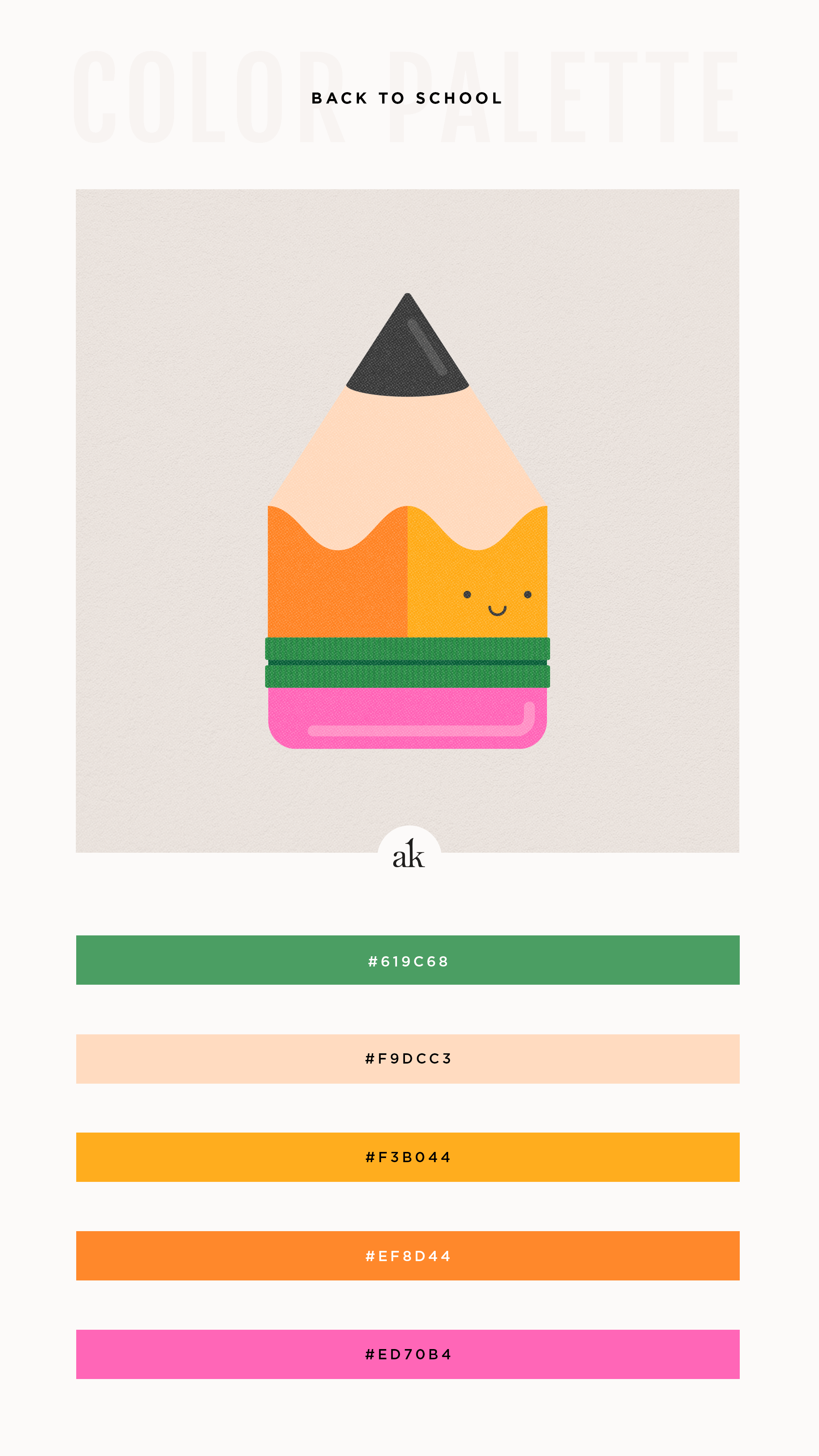
To celebrate the beginning of a new school year, I created a young and energetic color palette based on a classic no. 2 pencil. It features “ferrule” green, cedar (a peachy, wood hue), yellow, orange, and eraser pink.
ICYDK :: a ferrule is the metal part that connects the eraser to the pencil. I had no idea until I looked it up today. Of course, googling “what is the metal part of a pencil called” led me down a rabbit hole of random pencil facts that I decided to turn into a mini diagram:
Happy Friday!
You can now download a free printable PDF of this color palette that includes values for print (CMYK) and web (HEX, RGB, HSL) - as well as the closest Pantone matches for coated and uncoated stock! It’s everything you need to recreate this color combo on your own.
Looking for more inspiration?
▼ ▼ ▼