The 2 Easiest-Fix Mistakes Most People Make With Their Branding
Imagine increasing your perceived value in under an hour. Sounds dramatic, but two small branding fixes can do exactly that.
Here’s why: design consistency—that is, using your fonts, colors, and visuals the same way across every platform—can increase customer trust by 94% and reduce confusion by 20%. Most consumers will even pay MORE for a nearly identical product if it comes from a brand they trust. * Crazy, right?!
And because people form an opinion about your visual appeal in 50 milliseconds, your branding has to communicate clarity and confidence instantly. *
Today, I’m showing you the two most common branding mistakes I see every day (and how you can fix both of them right now).
mistake no. 01
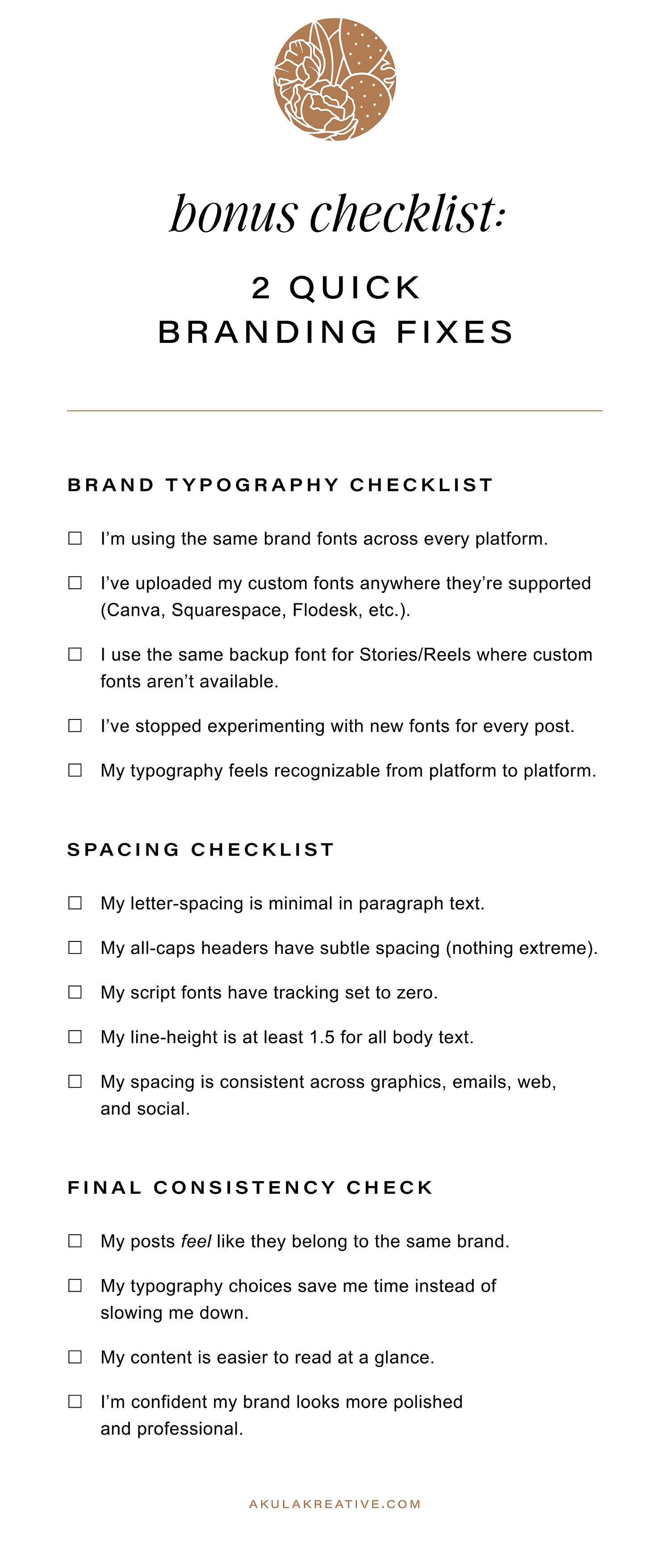
Inconsistent Typography
—
Why This Hurts Your Brand
If you find yourself hunting for a “fun new font” every time you design a post, this is your sign to stop. Trendy fonts make you blend in, not stand out, and every time you switch things up, you make it harder for people to recognize your brand. It takes 5–7 impressions to build awareness, and inconsistency resets the clock.
Also…think about it for a sec: you’re the only person who sees your brand every day. What feels “old” to you feels consistent, dependable, and trustworthy to everyone else.
The Simple Fix
Use your brand fonts. Every time.
Dust off your Brand Guidelines (or reference your website) and commit to the typography you already have in place.
Can’t upload your custom fonts to a platform? No sweat. Just choose the closest match and use it consistently. Platforms like Squarespace, Flodesk, and Canva now let you upload custom fonts, so once they’re in there, you’re set. (Just remember to check that you have a web license in addition to a desktop license.)
The Bonus Benefit
Consistency = speed.
When your fonts are chosen, you no longer start from scratch. Your design decisions are already made for you.
If you don’t have a solid font system in place yet, don’t worry. This is the perfect moment to create one. My free resource, Brand Font Collections Vol. I, walks you through choosing the right fonts for your brand (and includes 24 done-for-you pairings to make the decision easy). You’ll also find my best tips for building a cohesive visual style that communicates your message clearly and consistently.
Already have brand fonts but still feel tempted to “try something new”? That’s often a sign your visuals aren’t supporting you the way they should. You might find my guide, 6 Secret Signs It’s Time to Rebrand, helpful…or feel free to reach out with questions if you’re unsure what your next step should be.
mistake no. 02
Poor Spacing
—
Why Spacing Matters More Than You Think
When text is too spread out or lines are too cramped, reading becomes work…and our brains do not like extra work. Clean, comfortable spacing makes your content feel professional and effortless to read, which means people are actually more likely to stop and read it.
Quick Definitions
(So You Know What You’re Adjusting)
Letter-spacing (tracking):
How tight or loose the space is between characters. Great for small, all-caps headings… not great when overdone. (Have you noticed how almost every automotive brand has written their name across the back of vehicles with insanely overdone letter-spacing?? Ahhhhhhh, it kills me.)
Line-spacing (line height):
The vertical space between lines of text. More space = easier reading. Less space = cramped, overwhelming, and visually heavy.
The Simple Fix
Use little to no letter-spacing for paragraph text.
Some spacing is fine for all-caps headers, but keep it subtle for everything else.Never apply letter-spacing to script fonts.
They’re designed to connect. For the love of Jesus - please let them.Use at least 1.5 line-height for body text.
White space is your friend.Once you dial in your spacing, keep it consistent everywhere.
Posts, pages, graphics, emails…everything.
An excerpt from Brand Font Collections Vol. I
Tip: Look away or close your eyes every few minutes so you can view spacing with “fresh eyes.” Even better, ask someone: “Which version is easier to read?” and don’t tell them what you changed. You’ll get an honest, immediate answer.
Conclusion
Design consistency builds trust, and trust increases perceived value. By simply using your fonts (and spacing) the same way across every platform, you instantly elevate your brand’s professionalism and make your message easier to absorb.
These two small fixes create a powerful ripple effect: stronger recognition, better readability, and a brand that quietly communicates, “I know what I’m doing.”
Try these adjustments this week and notice how much cleaner your visuals feel, as well as how much faster your design process becomes. And if you’re thinking, “I love this… but I don’t have time to implement all of it,” that’s where I come in. I’d love to help you make your brand look as strategic and thoughtful as it truly is.