How to Use Your Brand Colors More Effectively

You’ve got a brand color palette…but now what? If you’re unsure how to actually use those colors in your social media, client documents, or even on your website, you’re not alone. A well-chosen palette is just the beginning; how you apply it determines whether your content is clear or confusing. In this post, I’ll walk you through a simple way to use color contrast and hierarchy to bring clarity and rhythm to your visuals.


Featured Font :: Fifty Fifty
Disclosure :: This post may contain affiliate links, meaning I get a tiny commission if you make a purchase through my links - at no cost to you. Products I advertise are only ones that I have used, tested, LOVED, and paid for myself (unless clearly stated otherwise). Thank you for supporting resource like this one!
Let’s get to it!
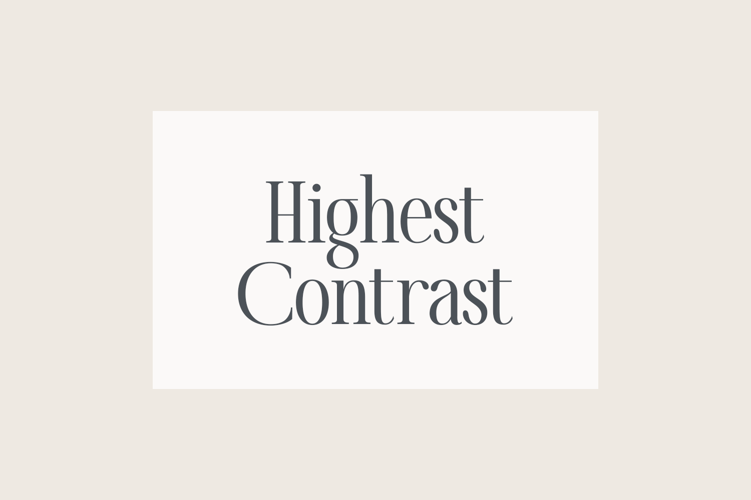
Your highest contrast heading should be reserved for essential information you need to communicate immediately. Here, I’m using the darkest text (100% tint of the dark neutral) over the lightest background (25% tint of the light neutral) to make the message pop.
This combo is perfect for pop-ups:
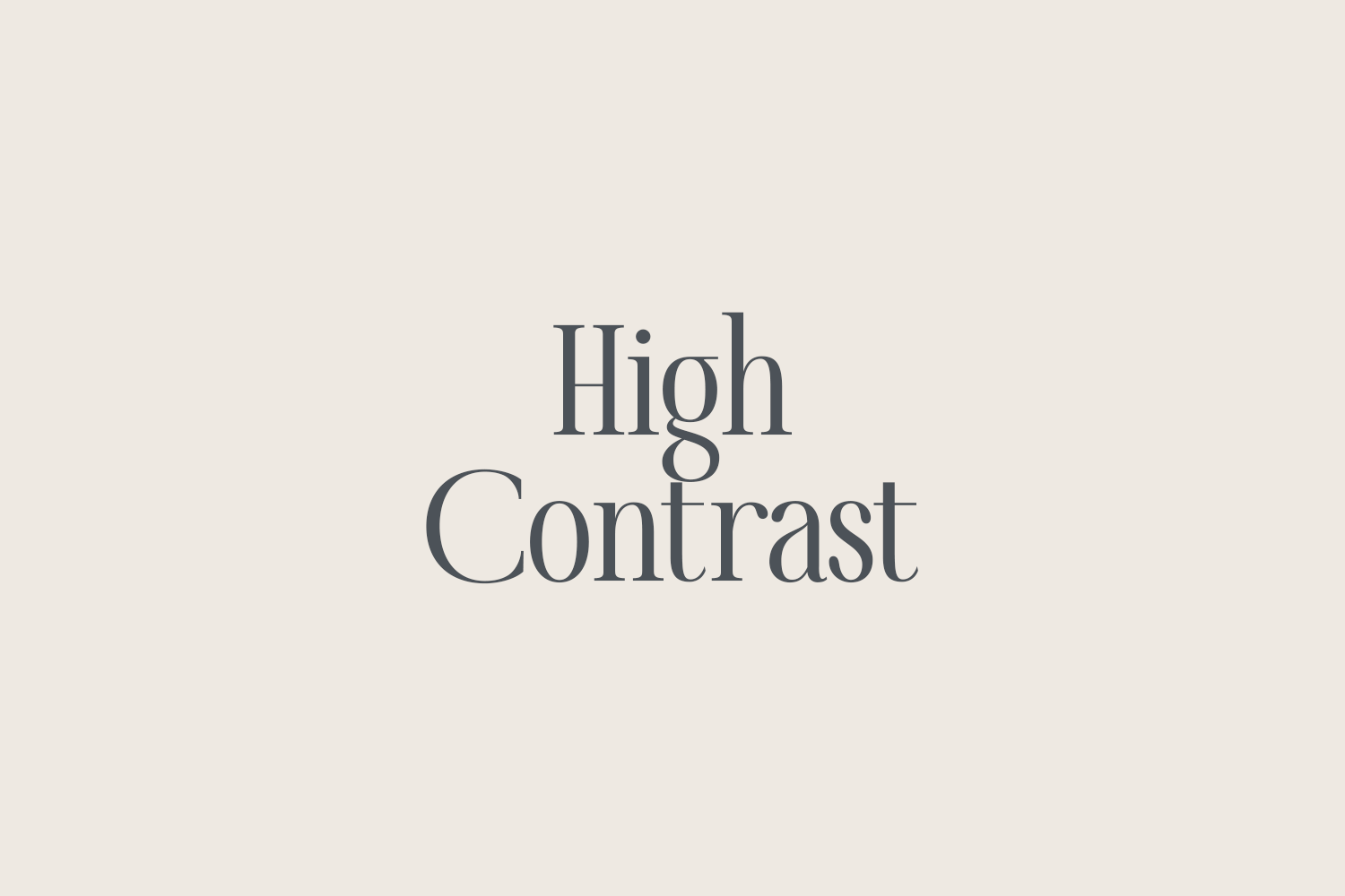
Your high contrast heading is for information you need to communicate quickly. Here, I’m using dark text (100% tint of the dark neutral) over a light background (100% tint of the light neutral). There’s slightly less contrast here, but it’s still very easy to read.
This combo is ideal for the banner on your home page:
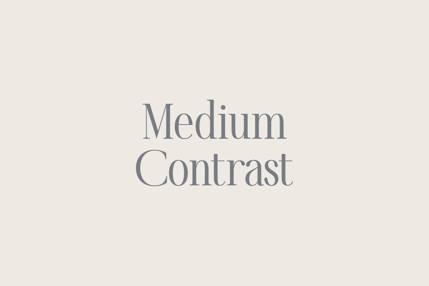
For secondary information, take the contrast down another notch to keep the attention on your most important heading(s). Here, I’m using a lighter tint of the dark neutral over the same light background.
This combo is ideal for the bio section on your home page. Once you’ve communicated what your website is about, you can provide additional information for those still interested.
You may be wondering, “Wait a second - explaining my background and expertise is pretty important - why should I treat this as secondary?!” I totally get that. However, the goal here is to use color and contrast to show people where to look first, second, and so on. We have to be extremely picky about which headings get the spotlight in order to create varying levels of visual importance. Without these levels, everything would feel the same and our readers may not know where to look first.

For automated responses, familiar phrases, and softer tones, take the contrast down yet another notch. Here, I’m using a tone-on-tone look with the lighter neutrals.
Here’s an example of what a user might see after submitting an online form:
Did you notice how the more familiar phrase within the automated response uses a larger font size in combination with the more muted color? The smaller font size of the sentence below requires higher contrast to be legible, so I used the dark neutral.
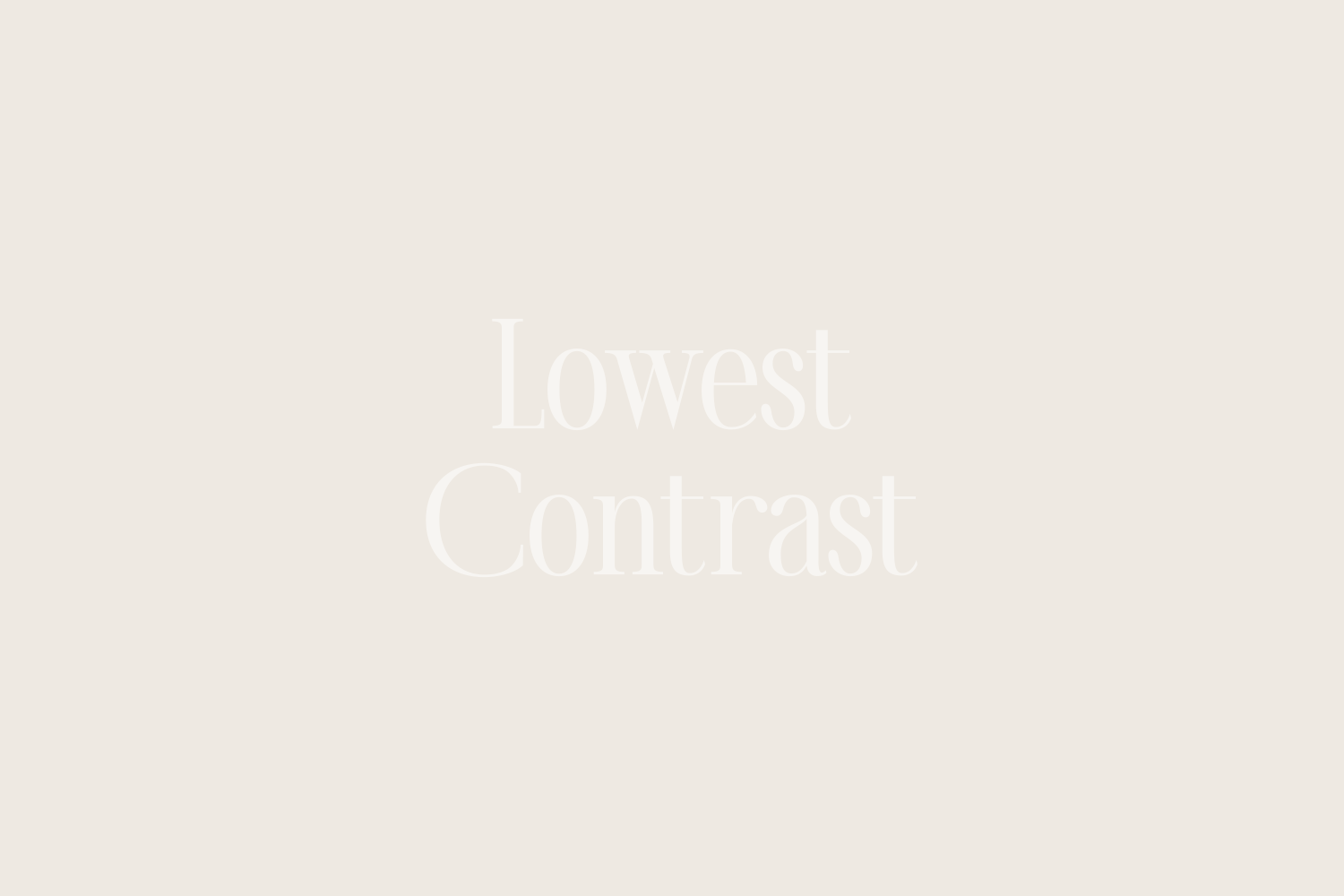
Here’s where you really start looking a pro! For non-essential info, like writing “Testimonial”—or, in this case, “Kind Words”—directly above a client’s testimonial, try using really LOW contrast to treat the type as a decorative, almost textural, element. Light text on a darker background is more difficult to read, but in this case, seeing/reading “Kind Words” is less important than the actual words of my client. Notice how your eyes move to the dark text first, even though it’s smaller?
When you understand how to use color hierarchy, your palette becomes more than “pretty.” It becomes powerful…strategic. With just a few contrast tweaks, you can guide the eye and make your brand look polished and intentional. Keep this framework handy the next time you’re designing, and let me know how it goes!