What Every Interior Designer Should Know About Color Modes
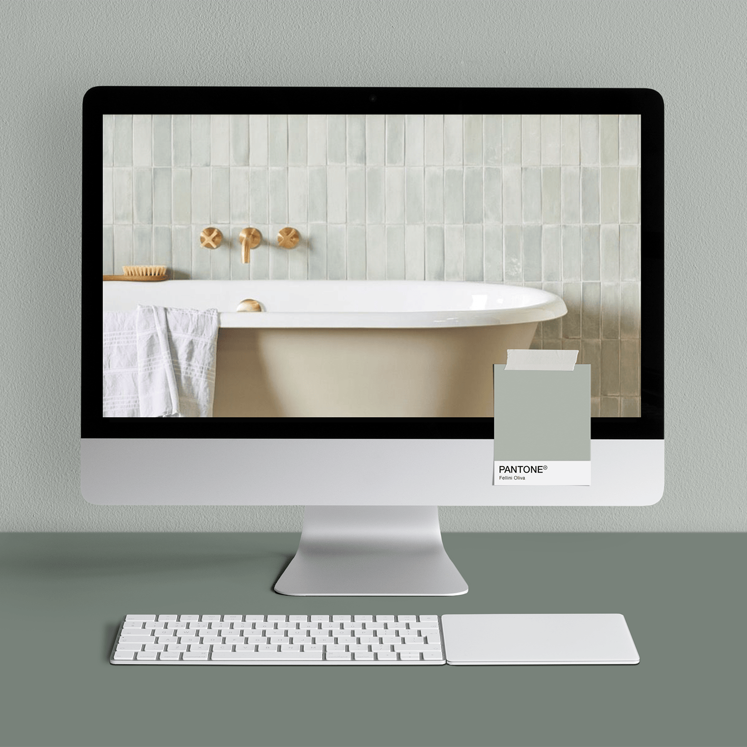
Bath Design Image © Claybrook Studio // Fellini Oliva Matt Wall Tile
Let’s talk about something interior designers get on a deep, emotional level :: color. You know the magic (and occasional mayhem) of picking the perfect paint swatch, only to see it skew blue once it’s on the wall. Sound familiar?
Welcome to the digital world’s version of that same chaos :: color modes.
If you’ve ever tried to match your brand colors across Instagram, business cards, and your website and thought, “Why does this red look like tomato soup in one place and like brick dust in another?” you’re not imagining it.
Let’s break it down.

The Web World: RGB, HTML, and HSL
These are the color modes you'll deal with most when designing online (think: websites, Canva graphics, social media posts, or email newsletters).
1. RGB (Red, Green, Blue)
Where it lives: Screens (phones, computers, tablets).
How it works: Light! Colors are made by mixing red, green, and blue light.
Quick fact: The brighter the colors, the higher the numbers.
When to use it: Any digital design.
2. HTML Hex Codes (six digits with the hashtag)
What it is: A web-friendly way to write RGB colors.
Why you need it: If you’re customizing your website or Canva template, you’ll often need to input your brand colors in hex format.
Quick fact: White = #FFFFFF, Black = #000000.
3. HSL (Hue, Saturation, Lightness)
Why it matters: If you’re a perfectionist who likes tweaking your colors, HSL is your go-to.
Fun fact: Designers (like me) use this to shift tones slightly without wrecking the whole color palette. Need to add some gray to that blue? Done.
The Print World: CMYK and Pantone®
Okay, now let’s talk about how your colors behave when you’re sending your logo off to the printer for business cards, packaging, or that gorgeous welcome packet you’re giving to new clients.
1. CMYK (Cyan, Magenta, Yellow, Black)
Where it lives: Printers.
How it works: It mixes inks—not light—so the results can look very different from your screen.
Quick fact: Colors often look duller in print than they do on screen. :(
2. Pantone® (AKA, the Holy Grail of Color Consistency)
What it is: A universal color language for print. One number = one exact color.
Why it's essential: Remember how your beautiful beige paint looked peach under warm lighting and gray under cool lighting? Screens do the same thing. Pantone® swatches are like that trusty paint chip: you can see it, feel it, and KNOW it’s the right color.
Why This Matters for Your Brand
Imagine this: You’ve spent hours creating your brand colors to perfectly reflect your aesthetic—warm terracottas, soft greiges, and that perfect sage green. It looks amazing on your website.
Then you get your business cards back. And your sage is suddenly mint. 😑
This is why knowing your color modes—and using a universal system like Pantone® when you print—is key. It’s the difference between looking like a luxury, high-touch designer brand and looking like you downloaded a free logo.
Final Thought (and Pro Tip!)
Think of RGB like your room with LED lights: bright, saturated, vibrant. CMYK is your same room, but lit with soft morning light: beautiful, but different. And Pantone®? That’s your trusty paint swatch, giving you peace of mind that what you see is what you’ll get.
Pro Tip :: When you're working on an Instagram post in Canva or customizing your website, stick to your hex codes. When you're printing, ask your designer or printer to use CMYK and Pantone® references to keep your brand consistent across the board.
Want help building a brand that’s as intentional as your interiors? Let’s chat. (I promise your letterpress cards will be color matched to perfection.)