Sneak Peek: A 1-Day Home Page Transformation
Last week, I challenged myself to “renovate” a home page within 24 hours. Why 24 hours? Just to show you how a few strategic tweaks can transform a website from “definitely DIY’d” to polished, personal, and professional in ONE workday.
First, let’s take a peek at the before & after…
BEFORE:
After:
Before getting started on the redesign, I had a quick meeting with Sarah to talk about her site. We discussed her goals, strengths, struggles, and everything in between. Luckily, I was already familiar with her brand because she’s been quietly working behind-the-scenes for me for over a year. (If you follow me on Pinterest, subscribe to my newsletter, or signed onto a project recently, you’ve been witness to her wonderful work.)
Outside of helping me and other business owners, Sarah has built a thriving online community, offering a weekly newsletter on natural living. Her brand is clean yet cozy, fresh, and approachable. When asked what she wanted to improve, she said she wanted a more “put-together look,” explaining she designed her site quickly and never had a chance to go back and change anything.
So here’s what I did…
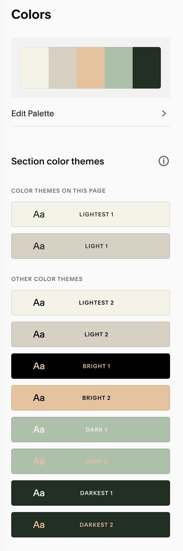
Old Color Palette
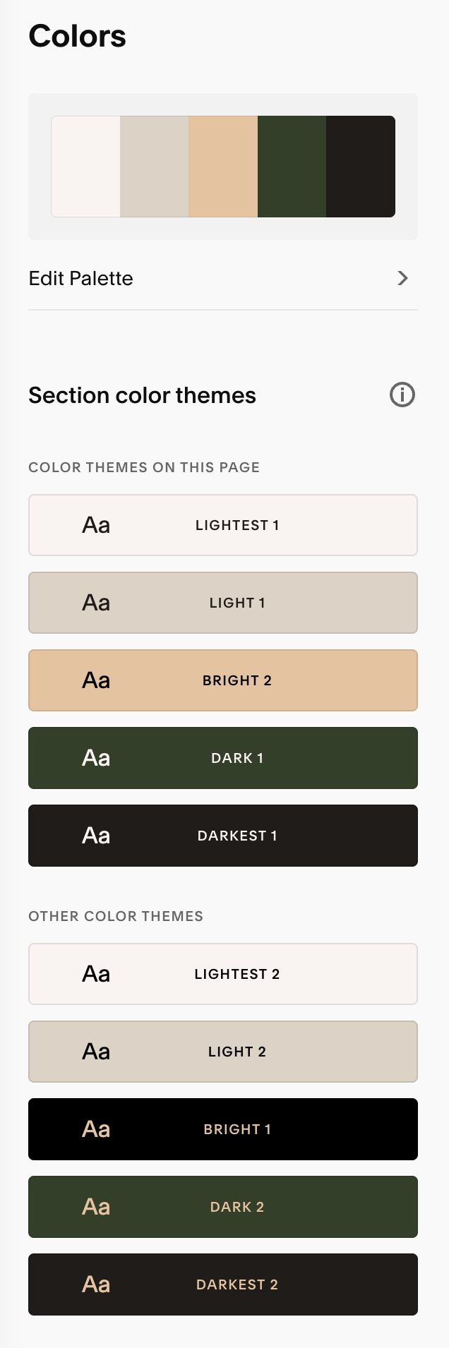
New Color Palette
step 01.
I refined the color palette.
Sarah was using a Squarespace-provided color palette. She basically said it got the job done, but she wasn’t attached to it. Also, she wasn’t a fan of the mint green. Knowing her (and her brand), I understood that the neutrals worked well for her. I tweaked those to make them a little warmer and brighter (read: less yellow), got rid of the mint, and added a rich, plant-inspired green.
Old Font Collection
New Font Collection
step 02.
I chose a new font collection and created a clearer visual hierarchy.
The fonts she had chosen (Playfair Display and Helvetica Neue) were fine, but I knew we could personalize things further with a new header font. With its refined serifs, friendly curves, and great readability, Juana Light ended up working perfectly. (It is not currently available on Squarespace, so I did have to add a bit of code to use a custom font.) To increase scannability, I updated the font sizes to better guide the viewer and I added a few keywords to make it super clear what the website was about.
Side note: I kept Helvetica for her body text because it’s a web-safe font she can use with her newsletter.
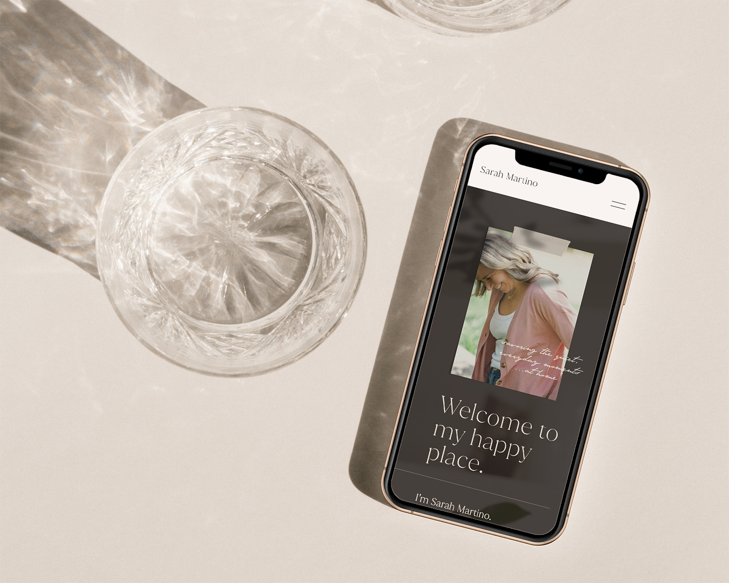
Old Headshot
New “lifestyle” Headshot
step 03.
I tweaked the messaging and swapped out her headshot.
Rewriting copy is not usually a part of my projects, but when I see an opportunity to send a message faster, I take it. I actually loved the IDEA of Sarah’s scrolling “Welcome! So glad you’re here!” text - not because it communicated something important, but because it established a feeling. She was cheerfully welcoming people to her website - just as she [virtually] welcomes subscribers and followers into her home. So, I opened her site with a banner image of her watering plants because a) she’s in it (which makes it personal), b) it has a green plant in it (which corresponds to the new color palette), and c) it invites visitors into her home. I don’t know about you, but just seeing her happily watering her plants makes me want to put aside a few minutes to tend to my own. The “taped snapshot” of her laughing adds to the welcoming, laid back vibe.
step 04.
I added visual interest with texture, layering, and a custom illustration.
Just as a handwritten letter feels more personal than an email, an image of a printed, folded photograph feels more intimate than a simple, digital image. To balance things out, I layered a subtle shadow of a hand holding wildflowers over the section backgrounds and under the text blocks. (BTW - it’s not by coincidence that the copy talks about growth in this section.)
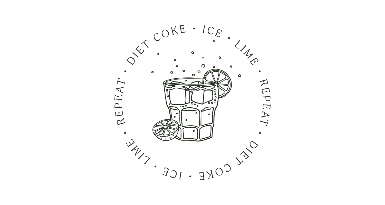
To add a tiny visual “treat” at the bottom, I drew Sarah’s signature drink: a Diet Coke with lime. Part of what makes Sarah’s approach to natural living so appealing is her stance that it doesn’t have to be “all or nothing.” You simply do your best and find what works for you. For her, that’s treating herself to a Diet Coke in the afternoon.
In closing
The next time you inquire with a designer and wonder if their higher hourly rate is worth it, you need to pay close attention to how much they can do in an hour. It’s taken me 2-3 hours to explain what I did, and why…when the entire home page redesign took maybe 6. When Sarah asked how I start projects like this, I told her, “Well, I just sit down with it and things start happening.”
I can’t wait to share the full reveal - stay tuned!
Ready to work on your site? Get in touch here.