Barlett :: A Vintage, European Serif
I’ve had my eye on this expanded serif by Tom Chalky for quite some time, and let me tell you: this one delivered! From the slightly uneven, perfectly imperfect edges to the delicate and detailed serifs, this handmade font just jumped to my favorites list. I can’t WAIT to use it for an upcoming project!
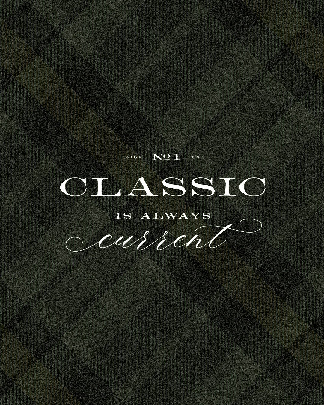
Introducing :: Barlett No. 1. “Inspired by 1800s English typefaces, this 9-style collection includes a range of serif styles and an elegant complementary script – all designed to bring a sense of character, imperfection, and manmade authenticity to premium design work.”
Important Note: The script you see above is actually called Slight by Up Up Creative. I needed something flourish-y yet legible for this layout, and this one fit better than the TC script.
Quick Font Facts
| FONT NAME | Barlett No. 1 |
| FOUNDRY / DESIGNER | Tom Chalky |
| TYPE CLASSIFICATION | serif |
| TAGS | classic, elegant, handmade, vintage, wide |
| WEIGHTS + VARIATIONS | Regular, Bold, Expanded, Expanded Bold, Round Regular, Round Bold, Round Expanded, Round Expanded Bold |
| BEST BRAND FIT | food and beverage, hospitality, interior design |
| WHERE TO BUY | Creative Market |
Disclosure :: This post may contain affiliate links, meaning I get a tiny commission if you make a purchase through my links - at no cost to you. Products I advertise are only ones that I have used, tested, LOVED, and paid for myself (unless clearly stated otherwise). Thank you for supporting my small business!


