Aloha Cafe
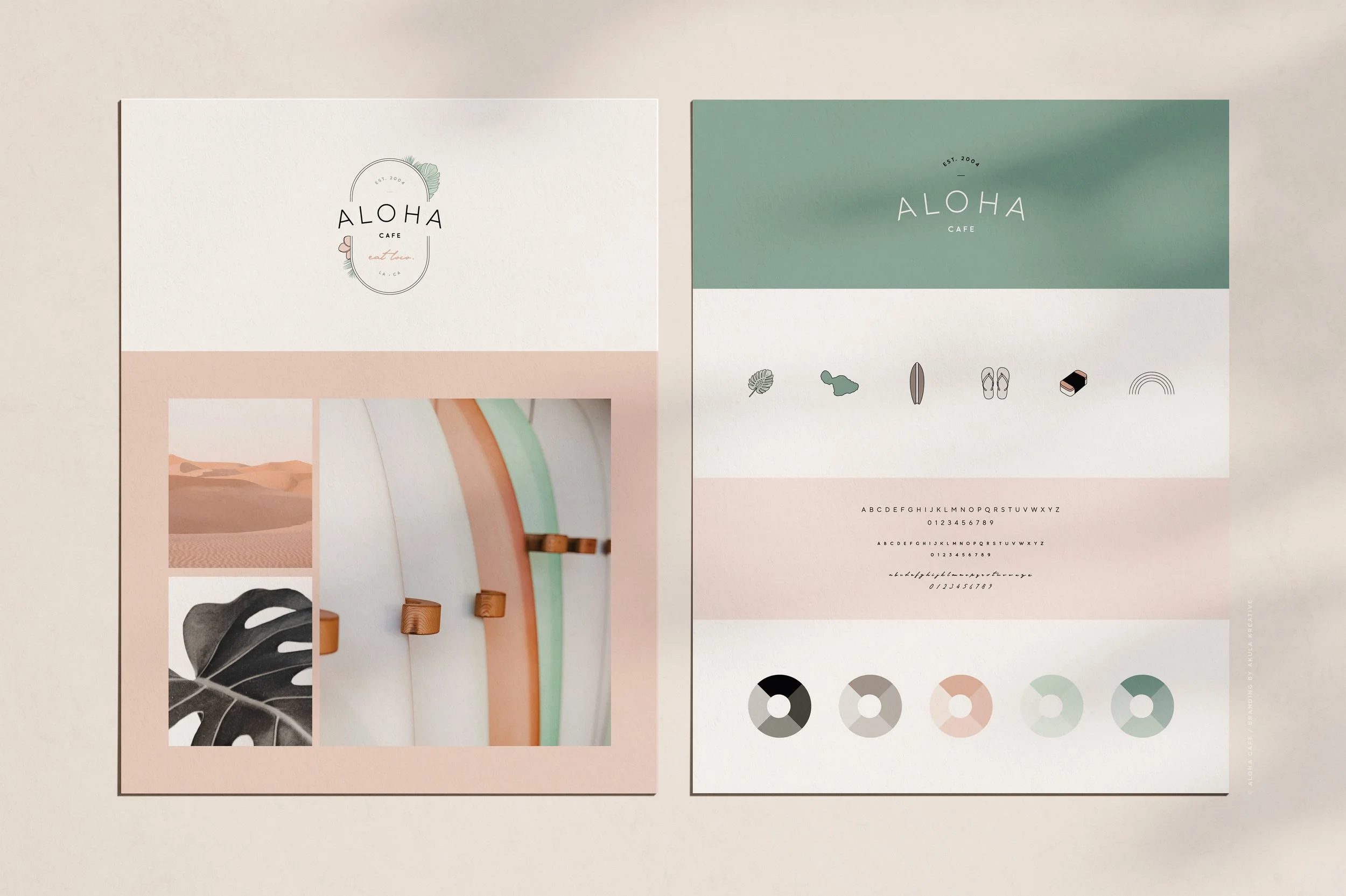
LOOK + FEEL
Fun. Modern. Distinctly Hawaiian.SERVICES
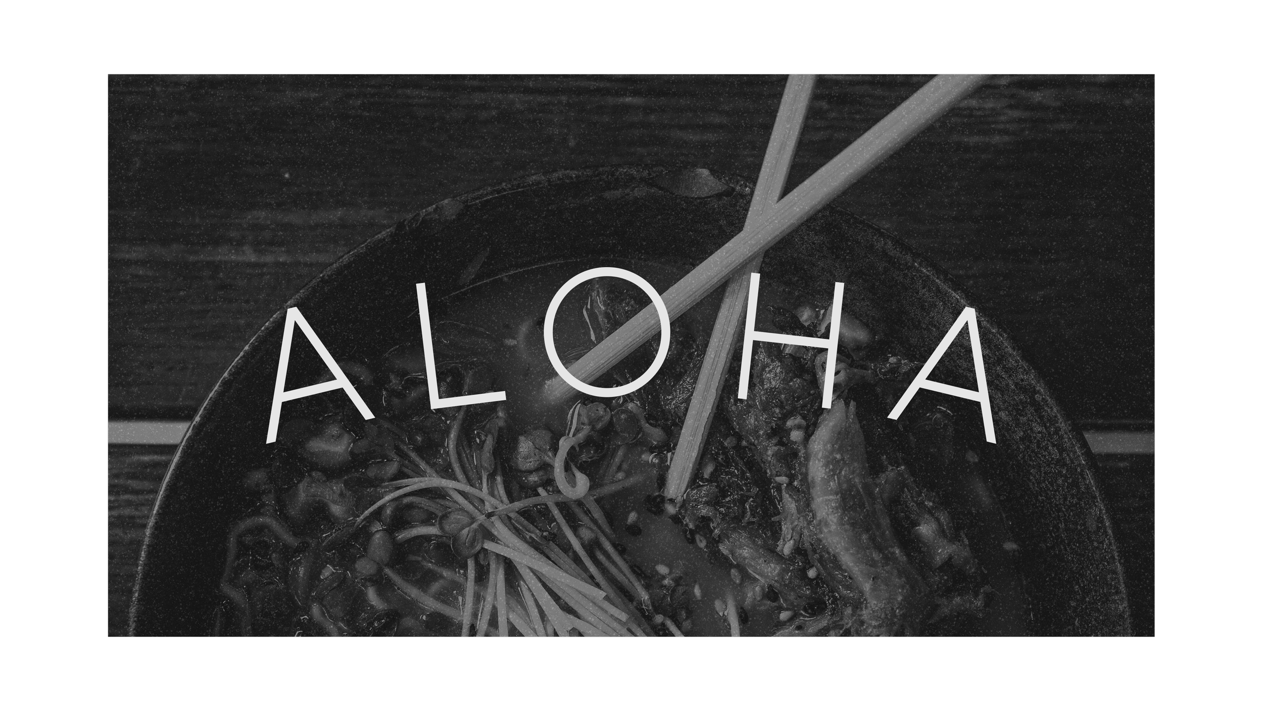
Brand Identity
Brand Handbook + Style Guidelines
Tagline Development
Menu Design
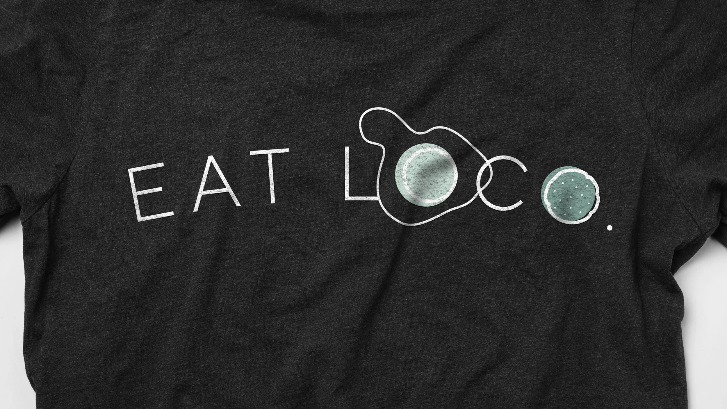
Merch Design
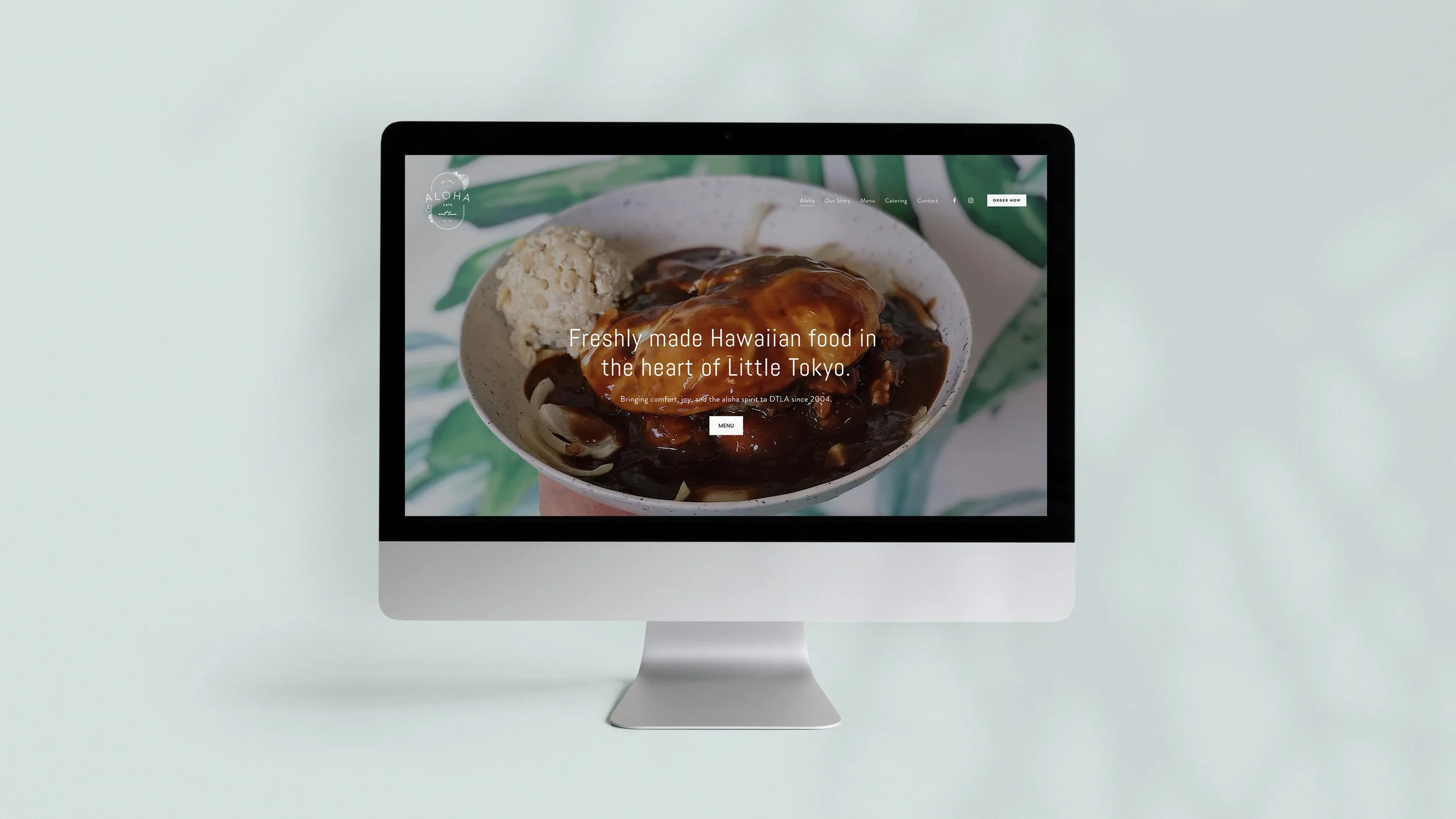
Squarespace SiteIndustry
Restaurant / Casual Dining
Event Catering
They rebranded because :: They wanted the outside of their brand to better reflect the inside. In Jennifer’s words - “I want to be able to be recognized as THE BEST and in order to do so I believe we need to have a new logo and a better way to [introduce] ourselves.”
What they do :: Bring people together. From Jennifer - “I fell in love with Aloha Cafe when I started working here as a server in high school. I had always loved cooking for people, but it wasn’t until the head chef, Komai, took me under his wing that the Aloha spirit became a part of me. In 2006, my heart broke when Komai passed away. After some time passed, I decided to take over the business and dedicate my life to building the best Hawaiian restaurant in LA.”
We loved working with them because :: Aloha Cafe is more than a Hawaiian restaurant. It’s a place where the community gets together, enjoys a comforting meal, and celebrates the aloha spirit.
One puzzle to solve was :: Aloha Cafe already had a loyal following, so they wanted the new look to appeal to those familiar with it AND to those who had no idea what it was. For those unfamiliar with Hawaiian food, they wanted the brand to feel modern, inviting, and friendly. For example, when someone sees their sign, our goal was to pique their interest and make them say, "Oooh! Let’s check this out."
What they said when they saw their first concepts :: “LOVE LOVE LOVE…I can see how you really put a lot of thought into the work. Thank you. Thank you from the bottom of my heart!!!!”
DETAILS TO LOOK FOR ::
a trucker hat that serves as a reminder of Komai, with plumeria added for a Hawaiian touch
a soft, understated color palette with the green pulled from the wallpaper they have inside the restaurant
an oval frame and curved text mimic the shape of a rainbow (often used as a symbol for Hawaii)
the egg white in “Eat Loco” is in the shape of Maui, where Komai grew up