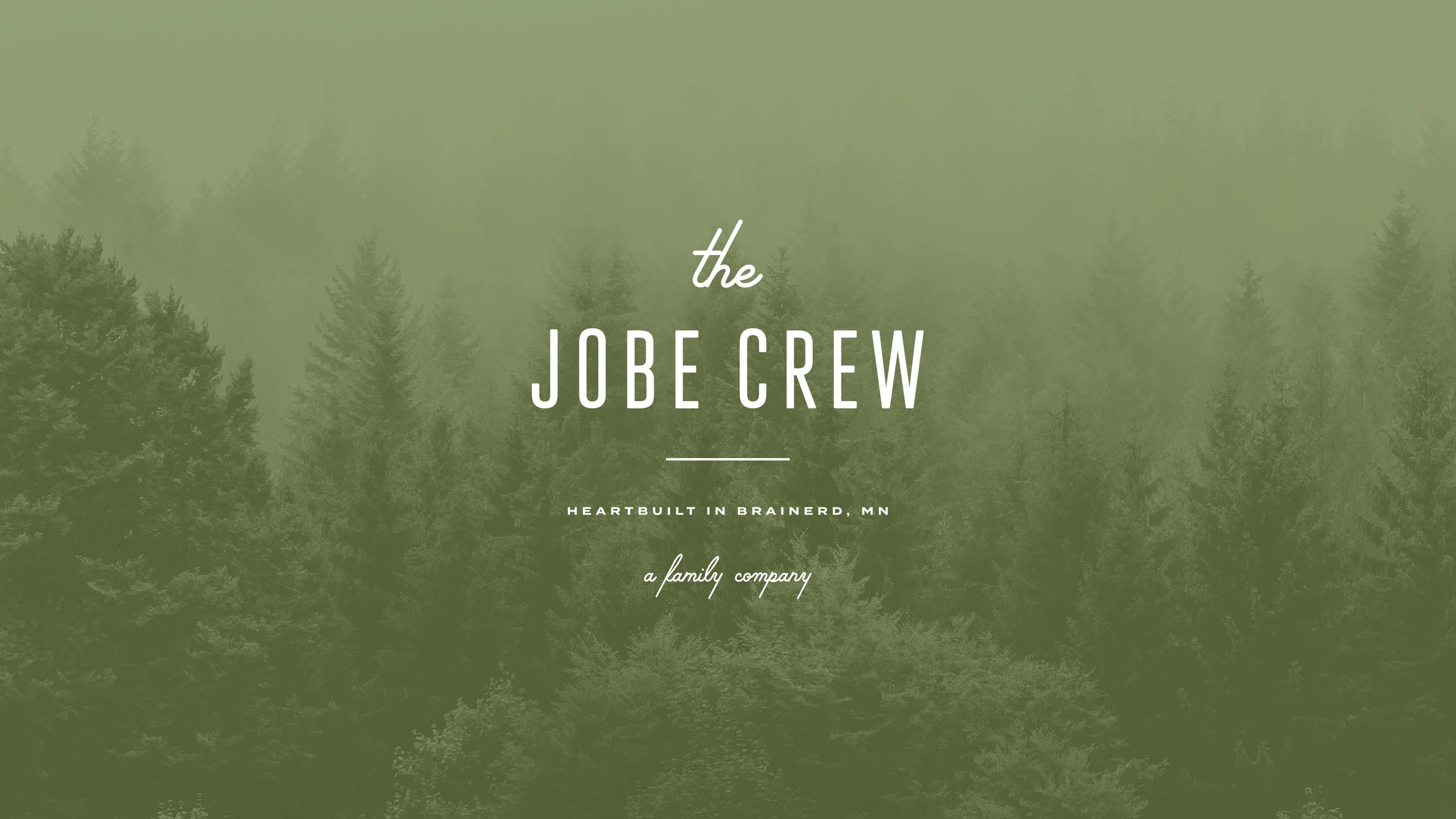
THE JOBE CREW
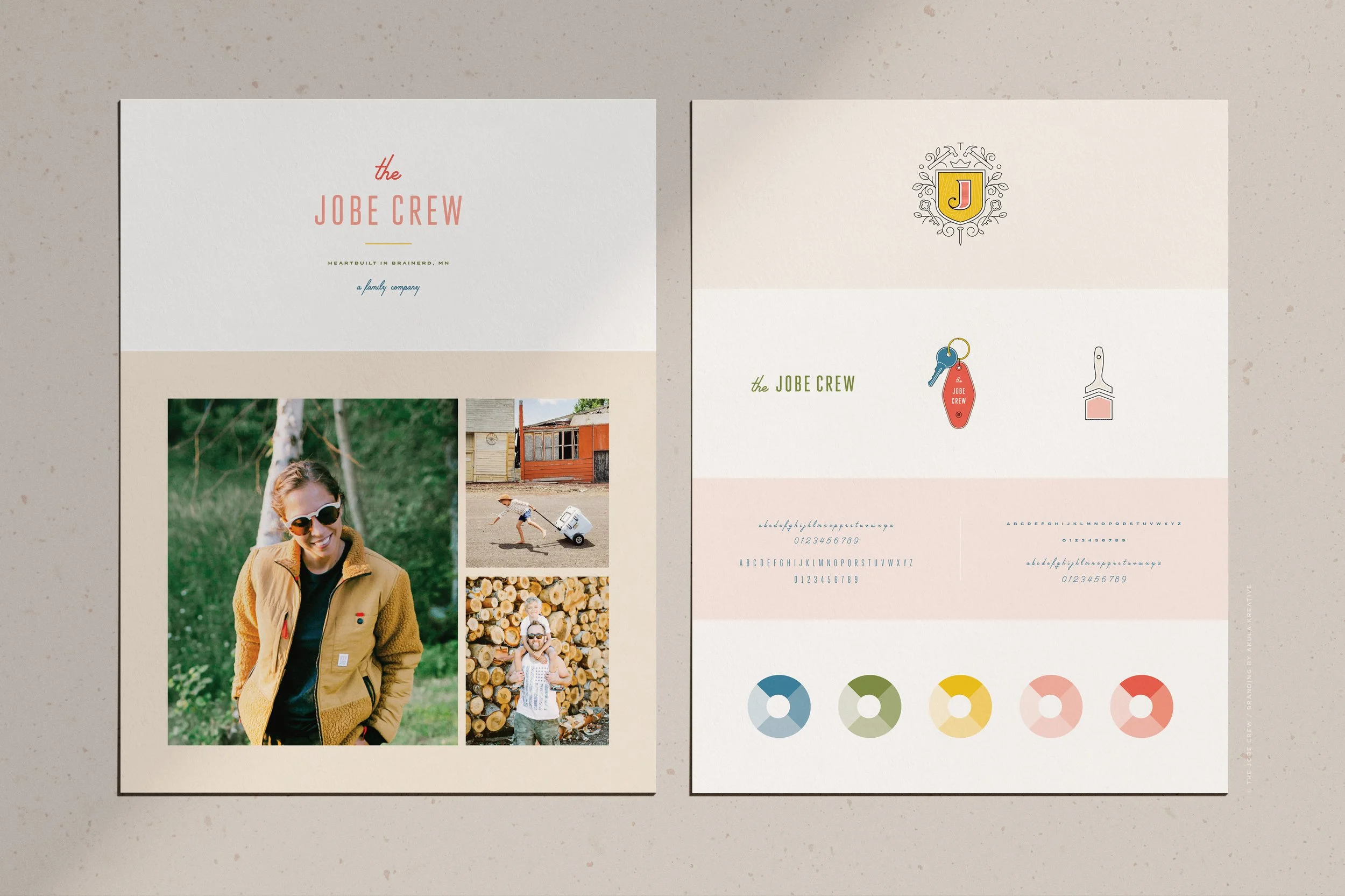
LOOK + FEEL
Creative. Modern Meets Vintage.SERVICES
Brand Identity
Brand Handbook
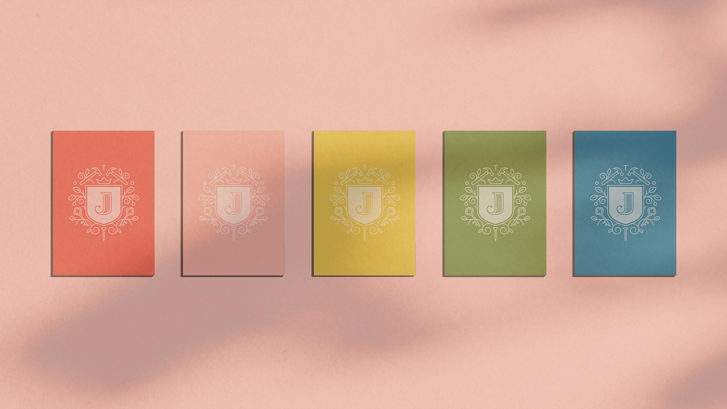
Style GuidelinesCOLLABORATORS
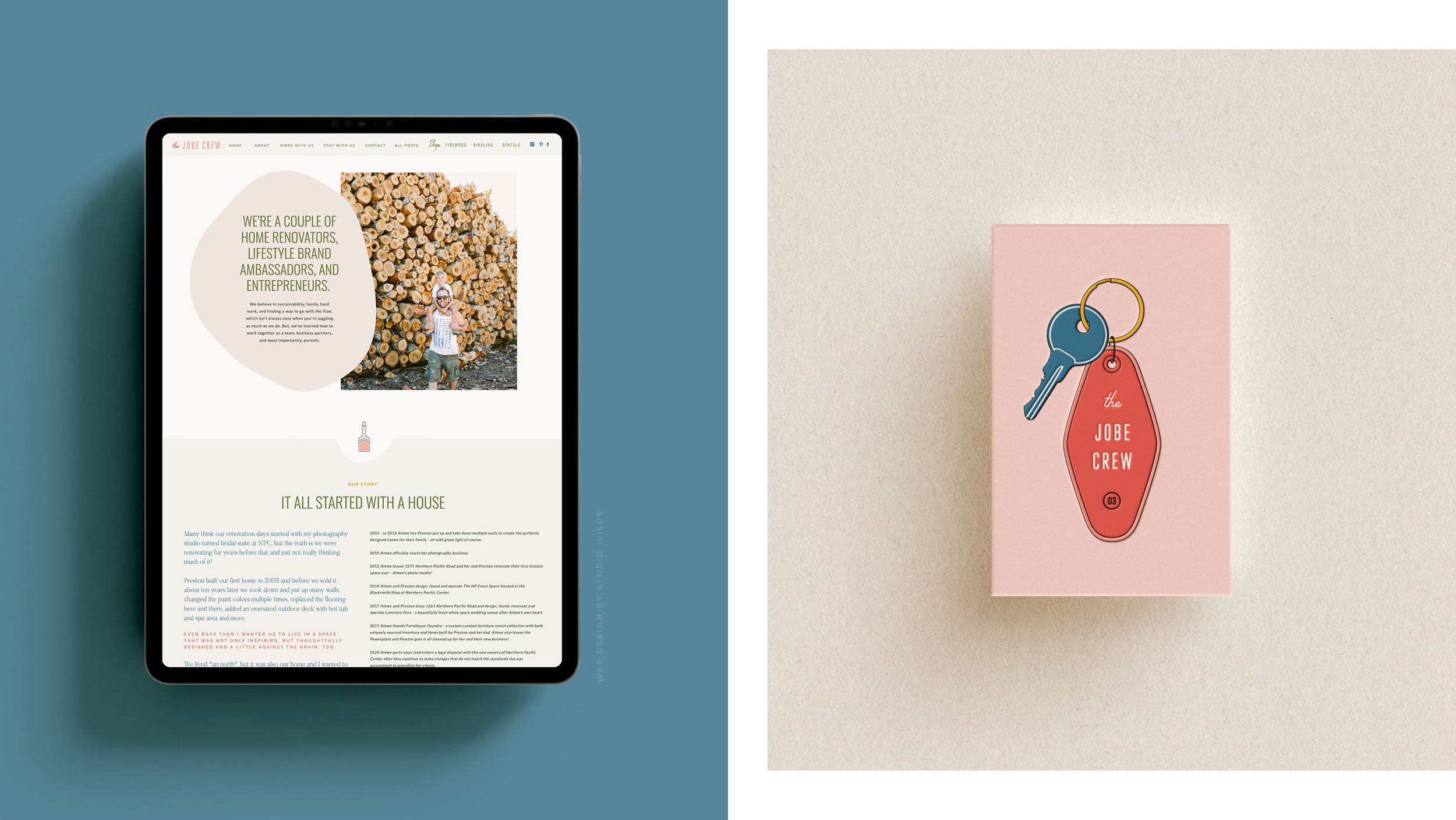
Website by Studio WildeThey rebranded because :: They were tired of making other people money. In Aimee’s words - “We want to build OUR future, not someone else’s….we need to start planning our long-term instead of making other people money.”
What they do :: Re-imagine properties. From Aimee - “We create beautiful, inspiring spaces! Whether it's someone’s home, a micro apartment, a vacation rental, or a women's recovery home,we're here to work with our hands and design things that bring happiness to other people's lives.”
We loved working with them because :: Aimee Jobe is unlike any other creative we know. Her heart, vision, and determination give her the unique ability to transform dark into light - literally and figuratively, personally and professionally. From renovating and restoring historic properties to transforming the wedding industry in her hometown, Aimee’s resumé is both awe-inspiring and mind-blowing.
One puzzle to solve :: Mixing modern with vintage. How do you think we did? We kept clean lines, but look closer - you’ll see details such as wood grain patterns and mixing of typefaces to lead with clean but finish with retro.
What they said when they saw their first concepts :: “I want to cry!!! They feel SO US!!!!!!!! OMG!!!! Your talent is beyond amazing!!! And the colors and tagline are perfection!! I don't know if it's just personal because it's our names and my family, but they are my favorite logos you've ever created!”
DETAILS TO LOOK FOR ::
modern sans-serif fonts mixed with vintage scripts
hammers and nails representing renovation // keys representing rentals // leaves and woodgrain representing forestry
hidden letters within the emblem (T, J, C)
the silhouette of Aimee’s firstborn child that can be found in the grooves of the key