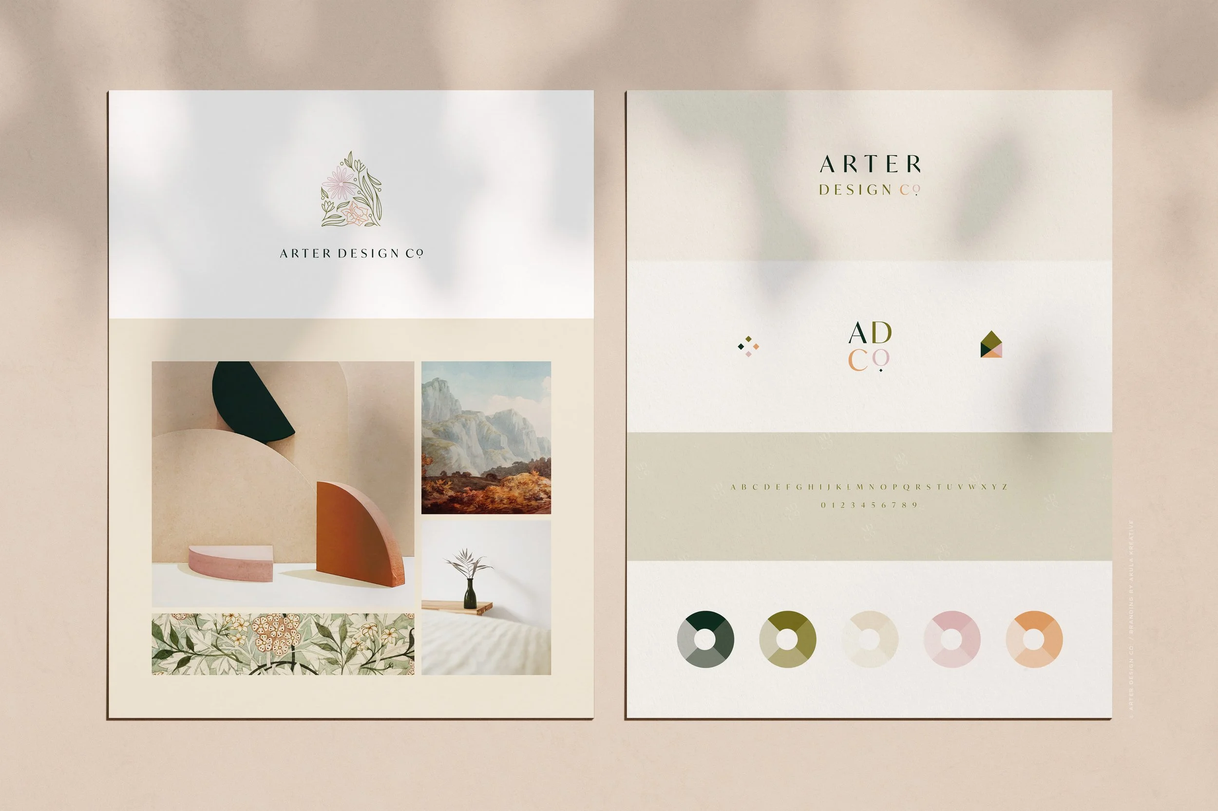
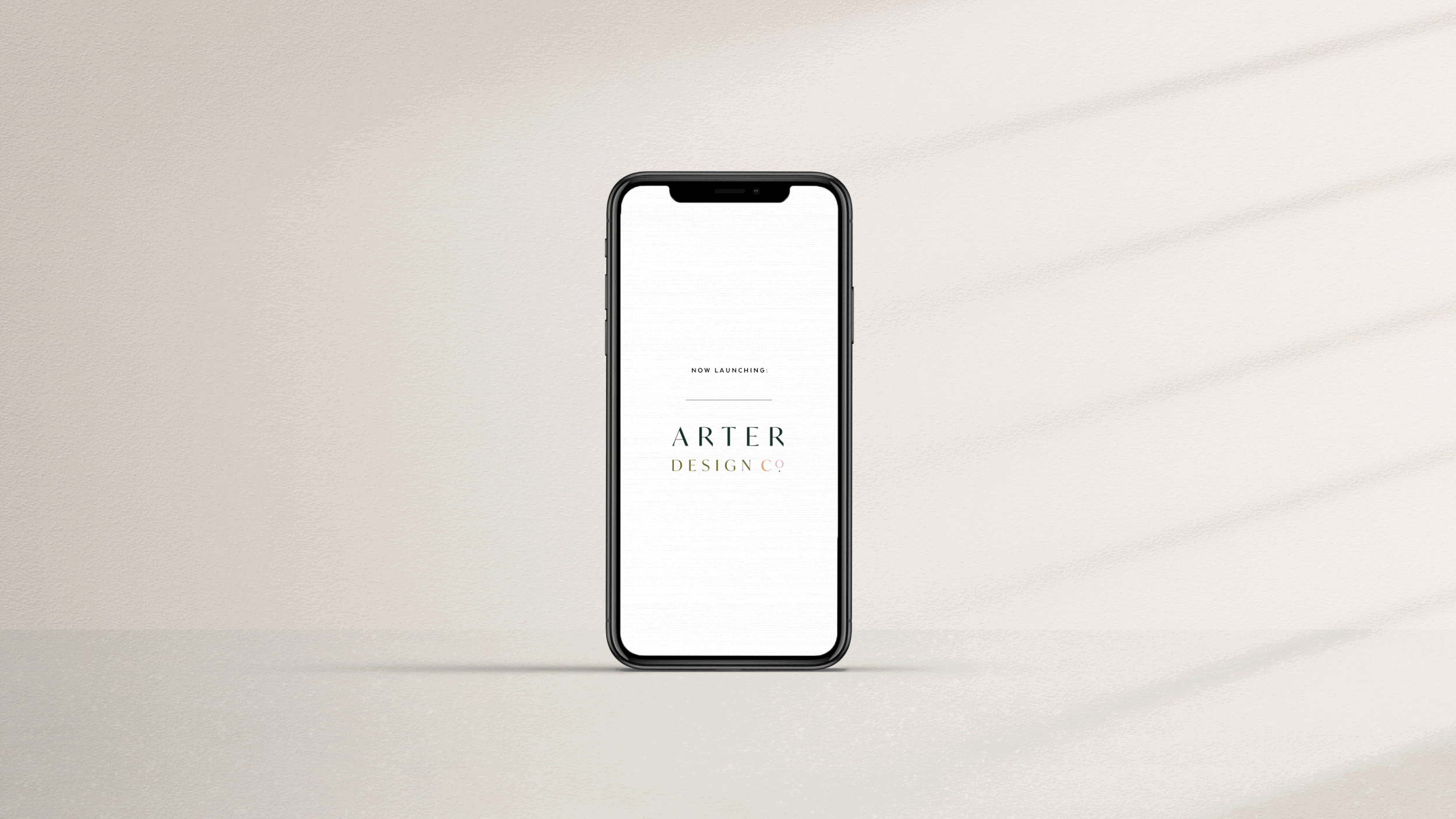
Arter Design Co.
LOOK + FEEL
Warm. Inviting. Fun.
SERVICES
Brand Identity
Brand Handbook + Style Guidelines
Brand Messaging
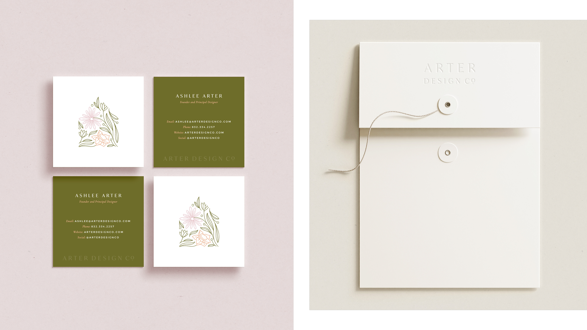
Business Stationery
Custom Squarespace Website
Industry
Interior DesignThey rebranded because :: Ashlee ventured out to start her own interior design firm, and although she had a logo idea, she knew she wanted help refining it as well as building it out into an entire, cohesive brand.
What they do :: Create warm and welcoming spaces for anyone who wants to love being home.
We loved working with them because :: We know your business is yours, yet real magic happens when our visions align and you can trust us. Ashlee fully trusted us to design her a brand. She told us what she wanted, provided great inspo, and let us run with it. The mutual respect made this a fun project - and what a great opportunity to work with a new Texas business!
One puzzle to solve was :: Incorporating her sons’ birth flowers in a subtle way, while also creating a logo that communicated “interior design.”
After working with us, they said :: “The results were so much better than I could have ever imagined. [Despite my] fear of the unknown—not knowing what I was going to get (and if I was going to like it)—I had so many options to choose from…all of which were beautiful. I am still so proud of what we created together. I tell people about you all the time!”
DETAILS TO LOOK FOR ::
hand-drawn botanical elements give the refined brand a more approachable demeanor
tiny diamonds repeated throughout. a graphic using 4 diamonds create an x in the negative space (a nod to her sons, who both have an x in their name)
a mixture of traditional serif fonts with modern sans-serif fonts match the client’s new-traditional aesthetic
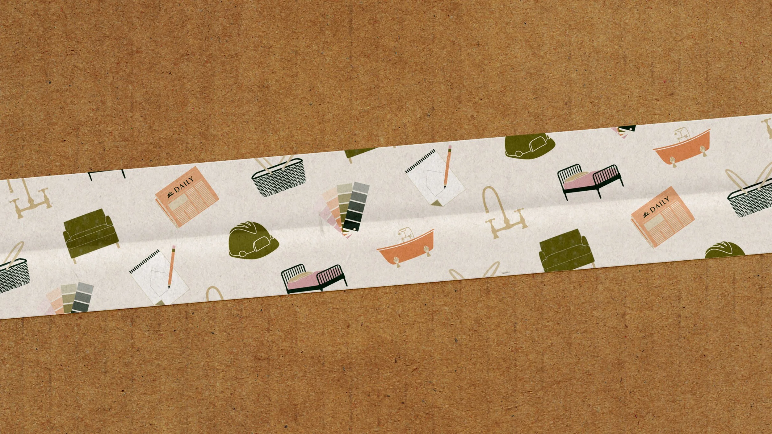
the floral elements from the logo are repeated as a pattern in the upholstered chair and curtain icons