Quinta Silvestre
LOOK + FEEL
Sustainable. Funky. Creative.SERVICES
Brand Identity
Brand Handbook
Style Guidelines
Social Media Kit
Industry
Permaculture FarmingThey started this business because :: In Shayna’s words - “[My husband and I] decided that we didn't want to raise our two young children where there was no room to breathe and where the focus was almost solely money. We wanted…more time spent with our family, in nature, getting our hands dirty and creating more than consuming.”
What they do :: Quinta Silvestre, meaning “Wild Farm,” is a 60-acre permaculture farm aiming to bridge the gap between conventional and sustainable living. Overlooking the Douro River Valley, Quinta Silvestre was founded by Shayna Frank, whose family relocated to Portugal from the Silicon Valley in search of a more meaningful connection to each other and the land.
We loved working with them because :: People like the Franks—people who literally put their money where their mouth is, who say they want change and then actually put in the work to make it happen—are our dream clients, and we are SO fortunate to know them!
One puzzle to solve was :: Making sure the branding didn’t look too ‘new,’ as American vintage typographic logos would not resonate with the people of Portugal. Also, communicating ‘art meets nature’ in a unique way.
What they said when they saw their first concepts :: “I really couldn’t be happier. I feel like you were able to climb inside my head and organize the mish-mash of jumbled ideas that were in there into beautiful art.
I loved your portfolio and felt like with your aesthetic we could come up with something beautiful and exceptional, but the clincher was when I realized how much you wanted to know about me, our business, our vision, etc. It made me more than confident that you would be working to make something that really represented us and our business, not just something that looked nice.”
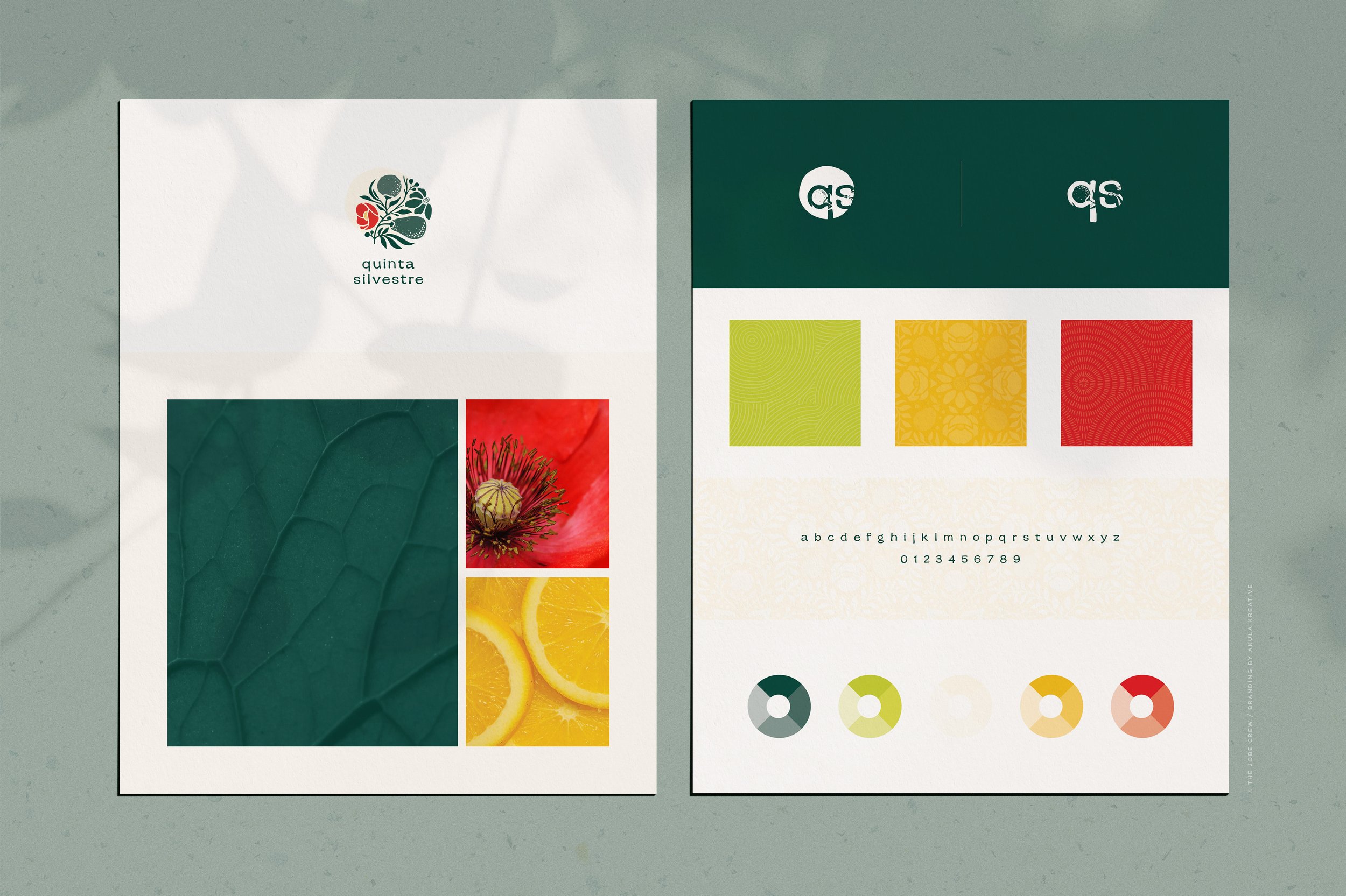
DETAILS TO LOOK FOR ::
a hand drawn mark gives the logo an organic and artistic feel. balanced yet imperfect.
the botanical element combines a variety of crops and wild flowers that can be found on the farm, representing connection to the land and community
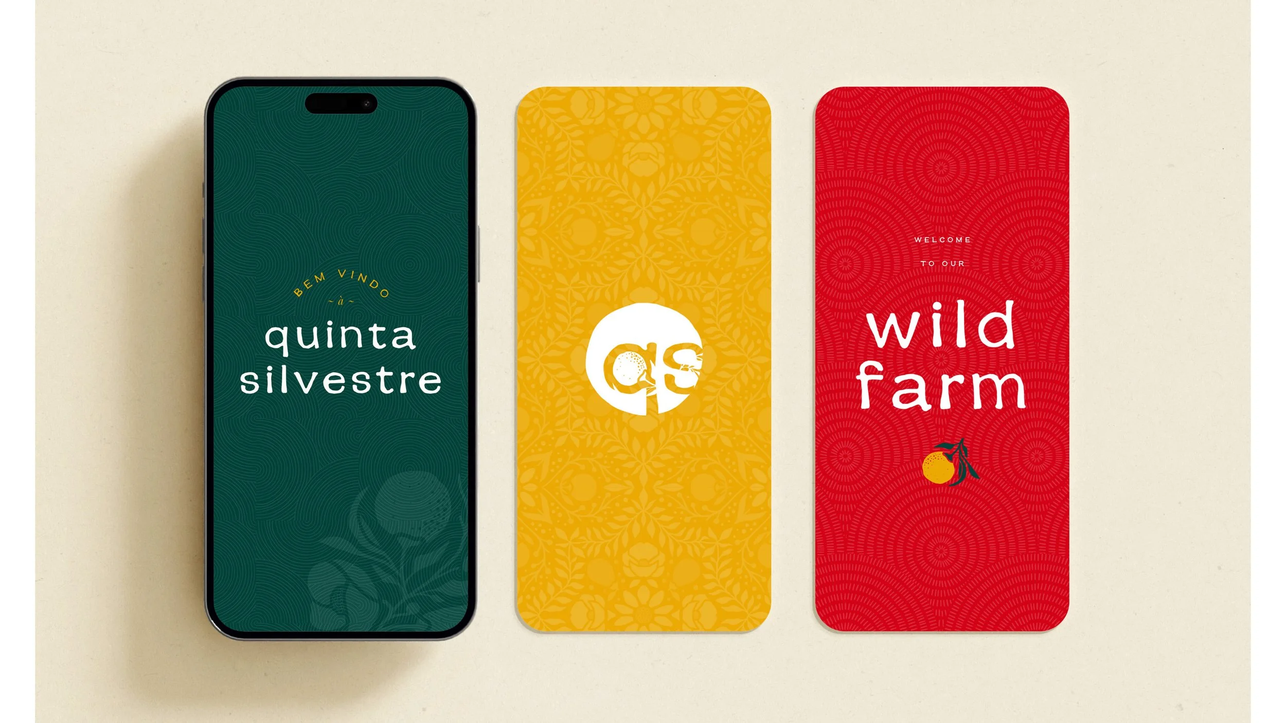
the fruits, leaves, and flowers from the logo have been repurposed to create a seamless signature pattern reminiscent of traditional Portuguese tile
the color palette is bold, funky, and unexpected, even though the core colors come straight from nature