an Italian-balcony-inspired color palette

an Italian-balcony-inspired color palette // natural, warm, authentic, boho // green, natural pearl white, peachy apricot, tuscan brown


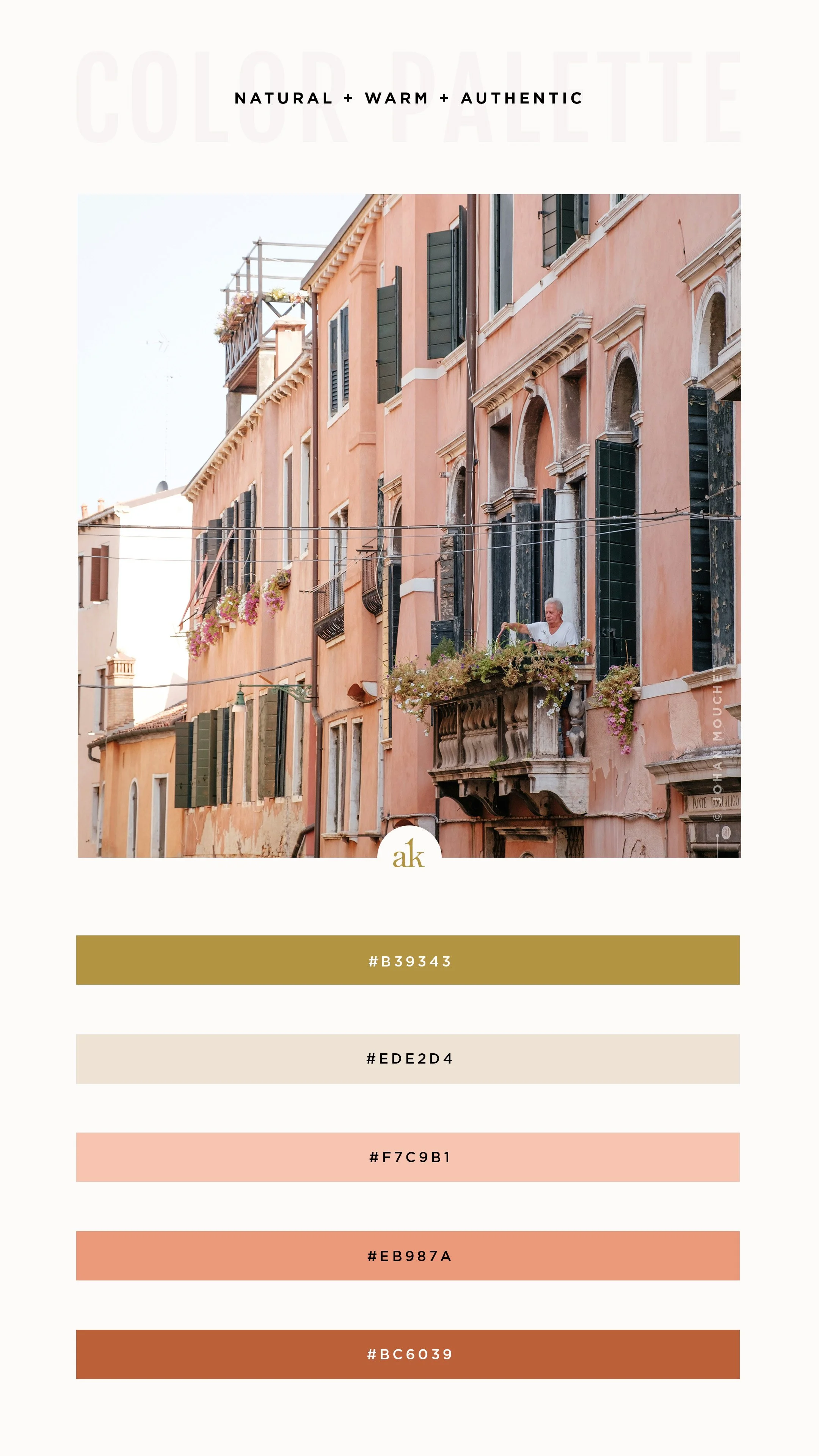
Isn’t it amazing how so many other countries have a signature architectural color palette? This image by Johan Mouchet is unmistakably Italian with its peachy-pink walls, dark green shutters, and warm white window frames.

Here’s a fun fact for you :: I lived in Italy for half a year (a long time ago), and seeing these colors really brings me back there.

Free, printable PDF of a warm, boho color palette that includes all color values: Pantone, CMYK, RGB, Hex, HSL, and more

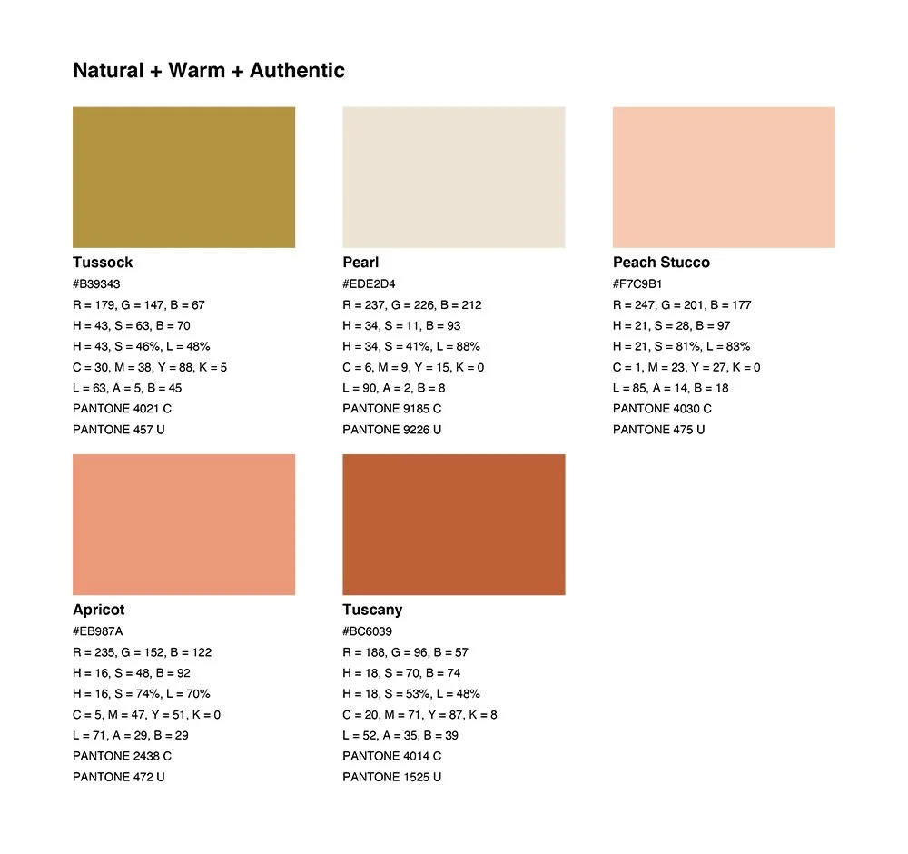
In case you missed it last week, you can now download a printable PDF that includes color values for print (Pantone, CMYK) and web (HEX, RGB, HSL). This is absolutely free for you to use—no strings attached—I simply ask that if you share it, you credit Akula Kreative and link back here.

Happy Friday!


Looking for more inspiration?

▼ ▼ ▼

Nikki Mihalik

I create branding and websites exclusively for interior designers, builders, and design-led visionaries who are ready for a full waitlist with press requests. No two brands are alike, but my signature style focuses on clean lines without sacrificing detail. My clients have been featured in Architectural Digest, BOH, Martha Stewart, and more.

http://www.akulakreative.com
Previous
Previous

an editorial-inspired color palette

Next
Next

a canyon-inspired color palette