How to Choose a Strategic Color Palette for Your Brand
In order to answer the question, “How do I choose colors for my brand?” you need to understand the basics of color theory. Check out this post for a deep dive - otherwise, trust me when I say: color psychology has a direct impact on how consumers make decisions.
3 facts about the power of color:
Colors can increase brand awareness by 80%.
Colors affect our behavior, mood, and stress levels.
93% of shoppers focus on visual appearance alone when they consider a purchase.
Source: Color Psychology Today
As a brand designer, my top priority is to communicate my client’s message as quickly as possible, to the RIGHT people. Seeing as up to 90% of an initial impression comes from color, I can’t, with good conscience, allow you to pick 2-5 of your favorite hues and call it a day. No, ma’am.
We need to choose colors that will:
Complement your offerings/work
Elicit a specific emotional response.
Let’s get started with my [simplified] Color Theory Chart below:
Tip :: PIN this color theory chart to save this post!
Now, ask yourself the following questions:
What tone do I want to set for my brand?
What do I want to communicate about the products/services I offer?
Are there specific colors that repeatedly show up in my work or products?
How will certain colors be perceived by my target consumer’s culture and gender?
What colors are used by my direct competitors?
Do I want to take a more traditional, obvious approach to color, or do I want to do something daring and different?
Regarding that last bullet point :: yes, the point of powerful branding is to stand out in a sea of competition. But you also have to know your audience. If you’re selling cheesy snacks to kids, choosing “pea soup green” packaging over bright orange would neither attract nor delight your tiny consumers. On the other hand, if you’re an interior designer with an edgy and daring aesthetic, perhaps you know that—when done right—adding hot pink to a black and aubergine color palette will actually translate as “fearless” instead of “sweet and sensitive.”
There’s a time, a place, and a marketing strategy for going against the grain, and you have to be ALL IN if you plan on “fighting” our learned responses to color. While taking the traditional route may not be the answer for some, applying long-established concepts of color theory will get your message across FASTER, and with LESS EFFORT.
How to compose your brand color palette
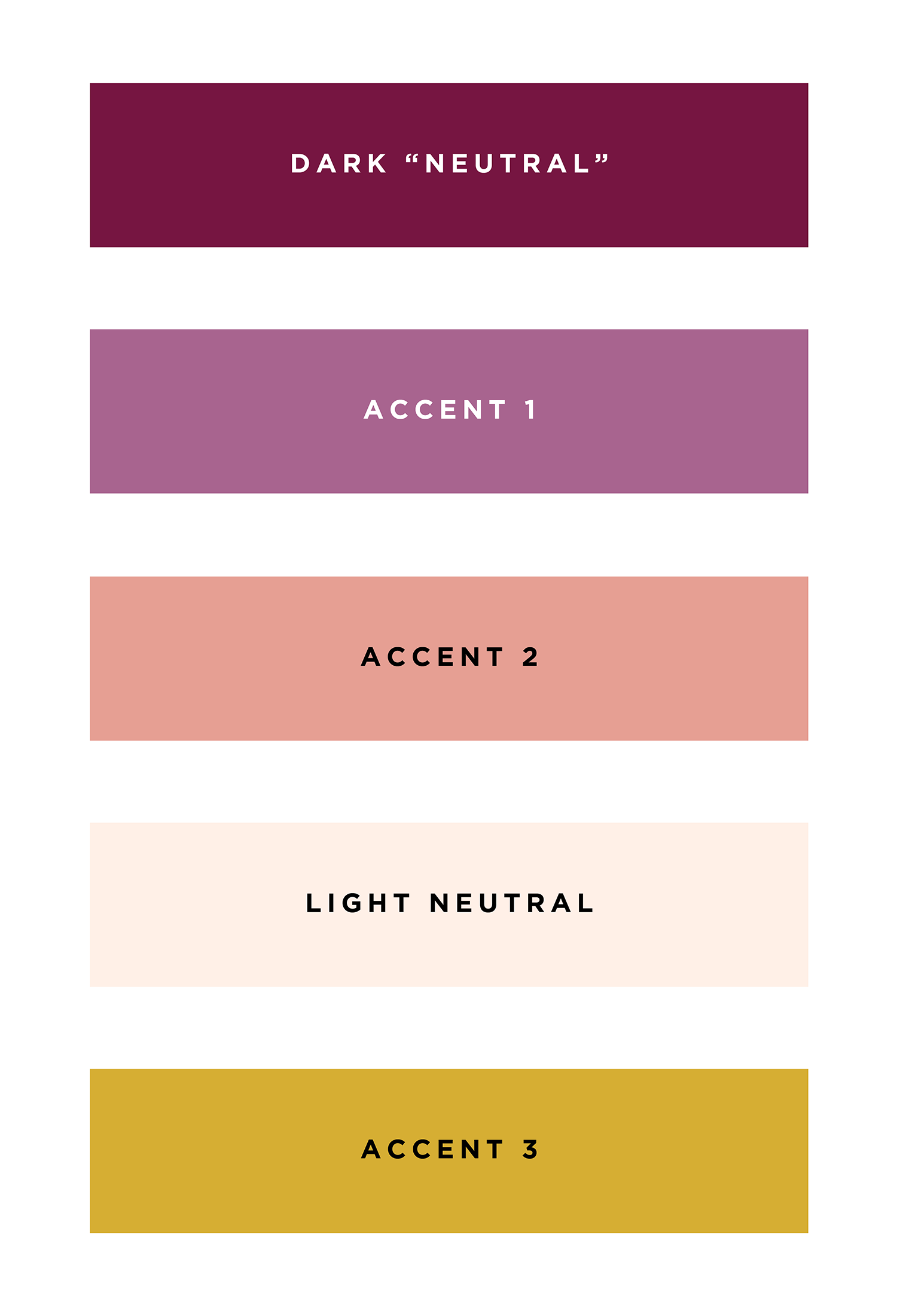
My Signature Color Palette Formula:
✓ 1 dark neutral
✓ 1 light neutral
✓ 1 primary accent
✓ 1-2 other accents (optional)
A “dark neutral” can be black, gray, or a very dark shade of any color. A “light neutral” can be light gray, tan, beige, greige, cream, or a very light tint of another brand color.
Here are two examples:
Though it may be tempting to use many different colors, keep in mind you can also use 1 color in various tints:
See how strong and recognizable a SIMPLE palette can be? Imagine you’re a small tent in a huge marketplace: how easily will your customers be able to spot you?
In addition to your messaging as it relates to color theory, another thing to consider is your work. Since my work is colorful, I use a very neutral color palette. Why? So my work remains the focal point and I never have to worry about my brand colors clashing with my clients’ projects.
If your work is known for a specific palette or you start to notice a pattern of the same colors showing up repeatedly in your images, consider brand colors that will complement your work instead of compete with it.
Branding is essential (obviously) but it should never outshine your work.
Take this photographer’s work, for example:
Now, check out the color palettes below. Even though the colors from Palette A are taken directly from the photographer’s images, they’re too strong. Palette B better matches the soft, romantic tone.
PALETTE A
PALETTE B
Color Palettes for Branding
Once you share your color palette inspiration with your designer, be sure to request the information below for each of your colors:
Color Values For print:
✓ Pantone® Numbers
✓ CMYK values
Color Values For web:
✓ RGB
✓ HTML/Hex
✓ HSL
Less experienced designers may not provide Pantones®—and, worse, they may design your entire brand around digital color (color produced with light on a screen)—but a brand’s color palette cannot be truly consistent without using a universal system.
If you’ve ever had to return clothing because the color turned out to be very different from what you saw online, you know exactly what I’m talking about.
Though we will never have complete control over the exact colors people see on their screens, we can ensure that we’re at least aiming for the right color and trying to match it as best as possible if we start with physical swatches.
Furthermore, when the time comes to order business cards and stationery, the only way to communicate your exact color palette to your vendor will be to provide Pantone® numbers. Without them, CMYK results will pretty much be up in the air until you see a proof (or the final product).
Just imagine what it would be like if your interior designer ordered all of your fabrics and finishes based off what they saw online. There’s a reason they’re constantly running around and gathering swatches and samples!
HOW TO USE YOUR COLOR PALETTE
Think of your color palette as a physical collection of paint. Each time you need to use color, dip into what you have. (Don’t be tempted to buy more!) Use your colors like your font collection; assign each one a purpose and a place and be consistent! You don’t have to use all of them, all the time.
Here are a few tips:
Use your dark neutral on a light background for paragraph text (any large bodies of text that require more serious reading). This is the easiest on our eyes and you want to make reading as pleasant (and as painless) as possible.
For your primary logo, use your dark neutral for your business name. There are exceptions to every rule—for example, you can get away with using lighter colors if you use a bold/thick/heavy font—but legibility is key!
Use your 1-2 other accent colors sparingly. Save them for when you need to call attention to important information. If you use them too often, people will get used to seeing them and start to ignore them.
QUICK RECAP
When it comes to brand colors:Know your audience
Choose your colors strategically
Use your colors consistently
Doing this will help you:Attract the attention of the people you WANT to work with
Increase brand awareness
Increase professionalism (which builds trust)
If you have any questions, please post them below. Thanks for reading, and Happy Friday!
- Nikki
P.S. If you follow me on Pinterest, you may be familiar with the color palettes I post every week. Here’s an important note about them:
These are not Pantone®-based palettes and they don’t always follow my “rule” of 1 dark neutral, 1 light neutral, 1 main accent, and 1-2 other accents. These are simply a source of inspiration—a starting point that will hopefully allow you to quickly pick out combinations that appeal to you.


